Sections, Tombs, and Stock Exchanges
Several years ago, a friend of mine gave me a small exhibition guide to "The Amsterdam Stock Exchange: A Structure Revealed," by Daniel Castor.
After winning a Fulbright in 1992, Castor "created twenty-two drawings [of the Amsterdam Stock Exchange] that, like x-ray photographs, enable us to look through the building's walls into its inner spaces in a way that one could neither achieve by means of photography nor by viewing the building in person."
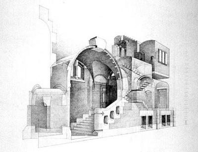
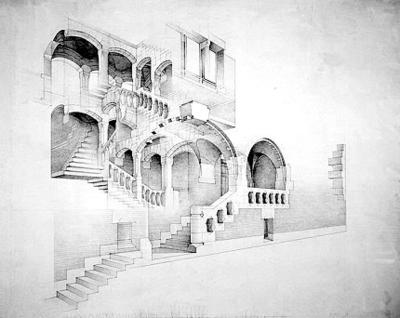

The drawings are "magnificently beautiful," the Getty's guide opines. By "gradually peeling away more and more of the exterior wall, like an archaeologist digging through centuries of rubble... Castor shows that the facade is no more than a thin layer around a circulatory space circumscribing the main exchange halls."
Castor also produced a series of sketches of Bramante's Tempietto –
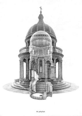
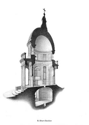
– of which these are two.
But then today I stumbled across a new post on Pruned, about Jean-Jacques Lequeu, architect, cross-dresser, amateur pornographer: "In post-Revolution and Napoleon France," Pruned writes, "Lequeu produced some of the most imaginary landscape and architectural designs" of his time, using "a masterful combination of the Gothic, the Egyptian, the Greek, the Chinese, and a smattering of hallucinations." And, however superficially, Lequeu's drawings reminded me of Castor's work:
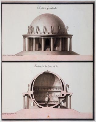
[Image: Elévation géométrale for Laqueu's Temple consacré à l'Egalité].
Then there is the quite similar, but really, really, really exciting Temple de la Terre:

If you enlarge the image, you'll see that the building's dome is actually a detailed globe of the earth, and that its surface is pierced by dozens of small holes; these allow light to burn through, into the interior, in the shape of constellations. Which, of course, makes it rather a lot like Boullée's Cenotaph for Newton –
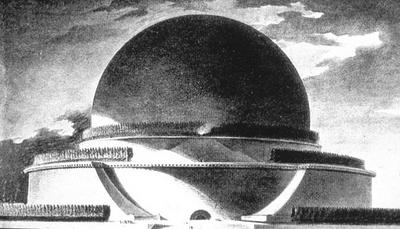
– but, in many ways, Lequeu's design is more interesting (if only because its less monolithic, less death-obsessed scale makes it a legitimate ancestor for today's planetaria).
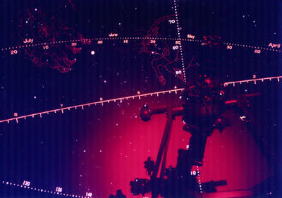
In any case, there are so many cool images – out of 784, total – on the Jean-Jacques Lequeu website that it's tempting to sit here uploading more and more of the things; but I'll stop.
Meanwhile, slicing buildings into sections, letting patterned light through, and using architecture to help model the constellations, will all be picked up again elsewhere...
After winning a Fulbright in 1992, Castor "created twenty-two drawings [of the Amsterdam Stock Exchange] that, like x-ray photographs, enable us to look through the building's walls into its inner spaces in a way that one could neither achieve by means of photography nor by viewing the building in person."


The drawings are "magnificently beautiful," the Getty's guide opines. By "gradually peeling away more and more of the exterior wall, like an archaeologist digging through centuries of rubble... Castor shows that the facade is no more than a thin layer around a circulatory space circumscribing the main exchange halls."
Castor also produced a series of sketches of Bramante's Tempietto –


– of which these are two.
But then today I stumbled across a new post on Pruned, about Jean-Jacques Lequeu, architect, cross-dresser, amateur pornographer: "In post-Revolution and Napoleon France," Pruned writes, "Lequeu produced some of the most imaginary landscape and architectural designs" of his time, using "a masterful combination of the Gothic, the Egyptian, the Greek, the Chinese, and a smattering of hallucinations." And, however superficially, Lequeu's drawings reminded me of Castor's work:

[Image: Elévation géométrale for Laqueu's Temple consacré à l'Egalité].
Then there is the quite similar, but really, really, really exciting Temple de la Terre:

If you enlarge the image, you'll see that the building's dome is actually a detailed globe of the earth, and that its surface is pierced by dozens of small holes; these allow light to burn through, into the interior, in the shape of constellations. Which, of course, makes it rather a lot like Boullée's Cenotaph for Newton –

– but, in many ways, Lequeu's design is more interesting (if only because its less monolithic, less death-obsessed scale makes it a legitimate ancestor for today's planetaria).

In any case, there are so many cool images – out of 784, total – on the Jean-Jacques Lequeu website that it's tempting to sit here uploading more and more of the things; but I'll stop.
Meanwhile, slicing buildings into sections, letting patterned light through, and using architecture to help model the constellations, will all be picked up again elsewhere...


Comments are moderated.
If it's not spam, it will appear here shortly!
Post a Comment