
RE: mapping the planet
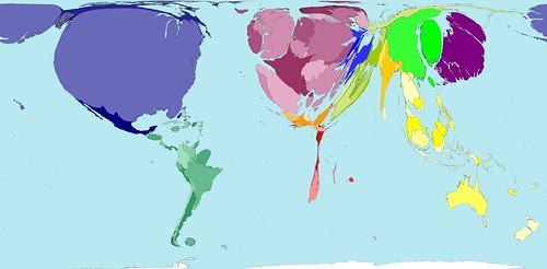 [Image: The world mapped according to number of aircraft passengers].
New Scientist has posted a cool article about the wonderful world of warped cartography, courtesy of Worldmapper, based at the University of Sheffield, UK.
Created by Danny Dorling and Anna Barford, Worldmapper transforms traditional cartographic projections using unexpected statistical guidelines: the world according to machine exports, car imports, working tractors, dairy exports, aircraft departures, children in the workforce, population in 2300 AD—etc. etc.
Their goal is to release 365 different maps throughout the upcoming year.
Some particularly eye-popping examples appear here...
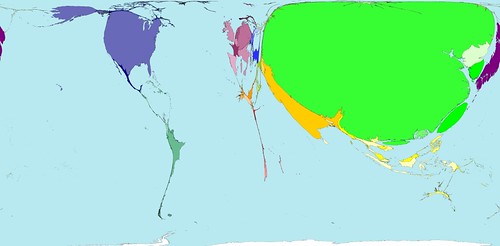 [Image: The world mapped according to number of container ports].
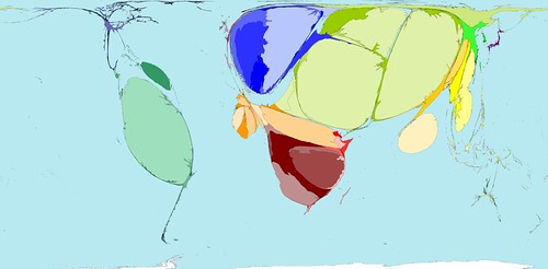 [Image: The world mapped according to refugee origin].
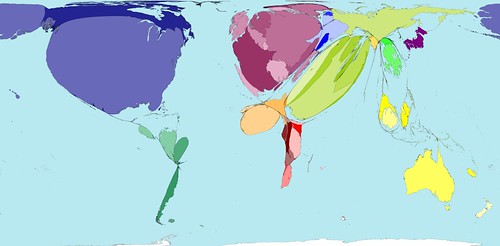 [Image: The world mapped according to net immigration – apparently no one's moving to India].
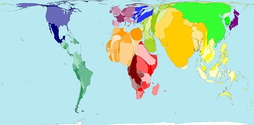 [Image: The world mapped according to expected human population in 2300 AD].
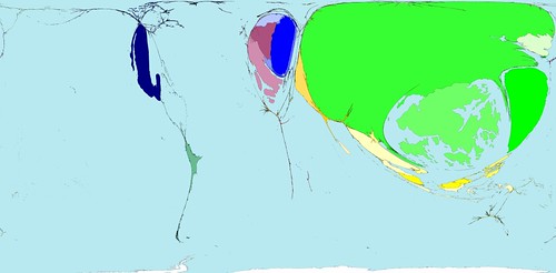

[Image: This is the world mapped according to toy exports and toy imports, respectively].
More—and more and more—of these maps can be found at Worldmapper.
While you're at it, check out these beautifully executed globes by Ingo Günther's World Processor.


Comments are moderated.
If it's not spam, it will appear here shortly!
am racking my brain trying to remember where i recently saw similar maps warped by the time cost of travel. any ideas???
-rf
i like the fact that the land area map in their website shows the world as it truly is. I have always wondered why conventional maps are skewed to make the northern countries seem larger than their southern neighbors.
q,
As you get away from the equator, the earth gets smaller. If you want to make a rectangular map, you have to start stretching everything east to west. Then in order to keep the shapes (in technical terms, to make it "conformal"), you also have to stretch things north-south.
So things far away from the equator, like Greenland, get mad large. Unfortunately, there is no way to make a map projection that is both "conformal" and "equal area."
Try flattening the peel of an orange some time :)
Somehow, "utterly fascinating" and "insanely cool" don't begin to cover it...
The greatest thing about all this is that any map projection now seems totally arbitrary - even using land mass and geography. Why is land mass better than any other? I've looked at maps all my life based on physical geography, but we might as well raise kids on maps of population, or maps of mobile phone use or maps of World Cup championships.
Fantastic find.
amazing!
Geoff-
City of Sound featured the distorted maps of Europe in January.
-
Very nice. Self-absorbed Americans may be interested in these of the U.S. showing party affiliation, population, etc.
Post a Comment