Rotating Liverpool
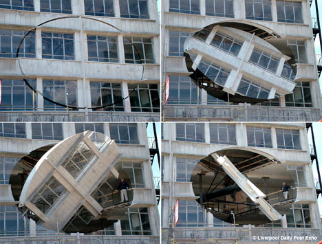
 [Image: Turning The Place Over by Richard Wilson; image via the Daily Mail].
In a project that "will astonish the commuters of Liverpool," sculptor Richard Wilson has turned part of a building's facade inside-out.
As if learning from Gordon Matta-Clark, Wilson sliced an "egg-shaped section" out of the building's facade – "fixing the eight metre diameter piece on a pivot" so it can spin.
 [Image: Turning The Place Over by Richard Wilson; image via the Daily Mail].
The "rotating facade" will thus "reveal a glimpse of the interior" – for the low, low price of £450,000.
(Thanks, Nicky!)


Comments are moderated.
If it's not spam, it will appear here shortly!
A mad effort. For what? Well, that's why art exists in this world. A waste of money. But wasting money is an art itself, sometimes. And we need art.
very creative, i like the idea but i don't think a residential building is the right application for it...maybe something commercial.
Reminds me one of your posts from early last year, where an abandoned building was turned into an AT-AT.
There's a video of the wall pivoting here:
http://www.youtube.com/watch?v=hktO3OdOPbs
Yes, we need art - but this is a hopeless idea. I know it's hard to be original, but this doesn't seem to add anything to any discussion that Matta-Clark didn't allready.
It does look cool and fun though. And probably gets all the attention they hoped for in Liverpool... but shouldn't art do more than that?
This is a magical installation, and one with profound meaning and impact. 'Turning the Place Over' does exactly that - by disrupting the certainties of architecture and of apparently inevitable decay, we see something strange, beautiful and hopeful. As a result, the building, the city and our expectations are all 'turned over' by this work.
Raising the issue of price is rather philistine, but having seen a presentation on the work's installtion, I can only presume that the intricate engineering and building work alone have contributed much to the costs. In any case, what price quality?
This is great. I would love to see it and although I know it is in Liverpool nobody has said where?
The installation is in Moorfields, right in the city centre next to a Merseyrail station
This one is quite an interesting creature. Although I don’t like modern style and big buildings, this work impressed me so much!
Wow! that is very expensive and absolutely serves no purpose other than a laugh to the commuters. I really think the building would do better with a paint job. None the less, its marvelous to see something like this. But the money? Give to charity? I think thats a better idea.
Art that may be viewed by all is in fact an act of charity.
Got a vertigo after looking at this masterpiece... Aren't they cold there inside the building?
This is just a copy of Gordon Matta Clark. Photos are not interesting at all, no creativity. They are just showing a process.
I find it to me more of a homage to Gordon Matt-Clark than a copy, Ilike it. Has anybody purchased the building yet?
"a homage to Gordon Matta-Clark" .... GMC cut with his own hands, he sqautted empty buildings and made poetic, surreal icons out of the derilect with simple direct actions. always temporal, thoughtful without being contrived... this is a "sell out" of GMC. This big Disney-esque production has none of the spirit. This is not surreal, its prop making engineering.
Lame. Richard Wilson has done better.
I have actually seen this art in person. It is a great piece of art when you walk down the street but then knowing how much it costs does make it a waste of money.
The building doesn't have inhabitents it is an old abondoned building of an old Yates's wine bar.
I did think that it perhaps would have been better done on an abondoned building closer to some landmarks, as when we were walking to it it was almost like, 'what could possibly be down here'. However that was howmost of the exhibitions were in the Liverpool Biennial.
See it in close though, it really is something else.
Post a Comment