Limey
 [Image: Habitat 825, by Lorcan O'Herlihy].
In an earlier post I mentioned a housing project by LA architect Lorcan O'Herlihy.
That building, called Habitat 825 – built right next door to the Schindler House and deliberately designed so as to cast no shadows onto its historically listed neighbor – has a particularly memorable use of the color lime green.
Now, thanks to a coworker of mine, I have a few photos...
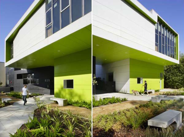
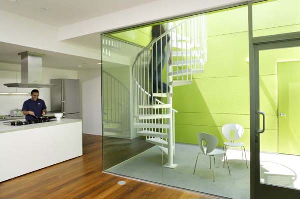
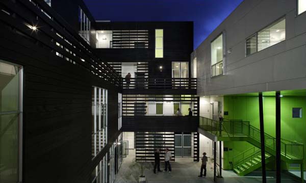 [Images: Habitat 825, by Lorcan O'Herlihy].
And I love this building! O'Herlihy's use of volume and color just knocks me out.
For more Lorcan O'Herlihy, visit the firm's website or read this earlier post on BLDGBLOG.
(Thanks, Chelsea!)





Comments are moderated.
If it's not spam, it will appear here shortly!
I love the arrangement of the windows, they cut through the building just enough to balance it. And the lime green is perfect for making such an intense structure appear fresh and airy. I'd happily live in a house like that :-)
Yeah, that green really opens up the space somehow, maybe if I paint one of my apartment walls that color it will have a similar effect...
-The AP.
what awesome photos
Cool...I just painted part of my living room that color. Such a cool feeling.
nicely done
the lime really emphasizes the building
http://archidose.blogspot.com/
Amazing photos! I love the dusk shot -- I think I like it less in the day the color doesn't pop so much but still very nice exterior. Not so crazy about the interior but I've got white issues. Cool post though.
Is there much credence to the rumor that apple green, perhaps the same hue in the photos, was very popular in many pre-WWII American kitchens? Because it was thought that it has a very calming effect on overworked housewives? Color as a practice of suburban domestic subjugation.
Your wife wants a dishwasher, wants you to do some cooking, to vote, to use contraceptives. You want none of this crazy talk, so you paint the kitchen apple green.
What's the color of Lucy Ricardo's kitchen beneath the televised black & white?
AT's comment is great. I seem to remember LO saying that he wanted to do something to do something "green" without competing with the Schindler garden.
Nicely done, right?
Although I agree the photos of the project are very nice and the language around not competing with the Schindler House is admirable, this review by Christopher Hawthorne of the LA Times is worth reading. I'm a fan of Hawthorne and generally find his critiques well-considered.
Link.
Another viewpoint...KCRW review with Frances Anderton
Link...
http://www.kcrw.com/etc/programs/de/de070918the_incredible_being
Post a Comment