An Earth Without Its Surface
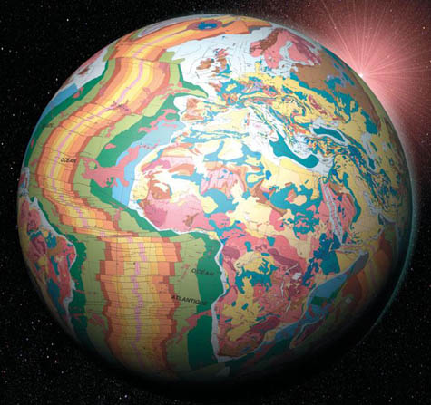
 The British Geological Survey has teamed up with fledgling science organization OneGeology to show us what the earth would look like without soil – or water, or cities, or anything, really, but geology.
 View larger.
I have to admit, on the other hand, that, as cool as this image is – revealing the semi-liquid mixtures of underground terrains that we walk over everyday – it's an absurd way to present the information. Badly colored and with a 1970s funk album sunrise coming round the planet?
Surely, with such a signature image, they could have made a better globe?


Comments are moderated.
If it's not spam, it will appear here shortly!
Look at other geologic maps, they tend to be colored that way. One reason I was told in school was that unlike political maps (boundary maps), which only need to be 4 colors, geologic maps require more colors to accurately present the diversity of geologic phenomenon. Thus you get a mishmash of different colors. But I agree, they could have used a wider array of colors to accurately present the information. At least they didn't use crosshatch shading...ack!
When I was a geologist, I noticed a sharp aesthetic sense was not always high on the list of professional attributes. Hence the sunrise flourish. But there are instances when the final product looks good.
Years ago, I helped out with the publication of a complete geological map of North America (working with the USGS, the Geological Survey of Canada, and Mexico's Consejo de Recursos Minerales). Geological map colors should follow certain conventions based on rock ages; the USGS, for example, has its own color standards. But it was a struggle to get those colors to look good on the North America map without straying too far. The graphic designer we worked with is actually listed as an author of the map.
I worked a lot on creating the related website, which was later shoehorned into the layout of a gargantuan federal mapping site. Can't win them all.
Have been looking forward to seeing this OneGeology project in action.
Tim, that's fascinating; I didn't realize - or I had somehow forgotten - that you had previously worked as a geologist. Great map! I linked the resulting PDF in my Quick Links list.
Let me add, though, that I didn't mean to imply that the actual color scheme was a turn-off for me - the salmon pink and the canary yellow and the Crayola turquoise - so much as that the globe looks like they left the image out in the sun for too long. It looks faded and bland. Of course, it's also a low-resolution jpg, so that surely has something to do with it; but it seems strangely early-1980s in quality.
In any case, this also isn't a jab at the OneGeology project - so apologies if offense has been taken anywhere.
Geoff, thanks for the link. We were really proud of that project.
And I agree completely that this could work as some classic late 70s/early 80s cover art. I think that's right on.
To Timothy Lesle,
I downloaded your map of North America and I think it's great. The Canadian Shield is very much noticeable. I'd like to see this as a layer on Google Earth.
A general comment about bldgblog: I've been viewing this blog for years and I absolutely love it. Keep up the great work. I'm also glad that the quick links are back.
I'm just some art student (ceramics specifically) from Canada wishing to get a masters in urban design. Love the website!
maybe there is a cylindrical or sinusoidal projection of it somewhere?
Yes, Mr. V,
A map is available (for purchase) from the commission for the Geologic Map of the world.
www.cgmw.net
This globe shows CGMW info; CGMW came up with the color scheme.
I've made a few oddball maps (world maps with constant-scale natural boundaries) with this data. Small res versions may be seen at
www.rightbasicbuilding.com
click on the "earth tectonics" page.
see if this appears as a link
http://rightbasicbuilding.com/page-test-1/
Somehow I think not.
I strive to incorporate 70's funk sunrises into each and every one of my visualizations. We're in the Age of Aquarius, you know!
If they're going to make a globe of geology why on earth would they choose not to shape the globe it actually is. A potato in all its goodness.
Post a Comment