Waiting Room
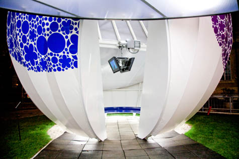 [Image: The Waiting Room, Rome, by Jeffrey Inaba/Inaba Projects].
Jeffrey Inaba of Inaba Projects has a new pavilion on display now in Rome, sponsored by Enel, Italy's largest utilities provider. Because of that sponsorship, Inaba "wanted to use numerous forms of alternative energy applications," but decided, in the end, to apply "just one that was highly productive and cost effective." The pavilion is thus solar-powered – Inaba describes it as an "Alice in Wonderland mushroom meets solar-ray chomping Pac-Man."
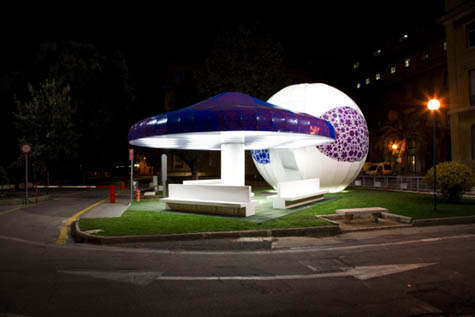
 [Images: The Waiting Room, Rome, by Jeffrey Inaba/Inaba Projects].
So what is the project? Solar-powered and lit from within, with a DVD player and monitors, it tries to rethink the hospital waiting room; in fact, the cartoon-like, festive structure with a kind of external tattoo of abstract graphics, is "sited at Policlinico Umberto 1, Rome's largest public hospital, and one that has been recently controversial because of scandals of unsafe and unsanitary conditions."
- As an "enlightenment" era hospital, it was planned in a decentralized way, with specialities (pediatrics, respiratory maladies, contagious diseases) distributed throughout the campus, with no single central space. The project attempts to create a centralized space for all kinds of waiting (waiting for an appointment, to be picked up, the diagnosis of a loved one, for treatment, convalescing to recover).
"The aim," Inaba writes in a short essay about the project, "is to produce a distraction from waiting by introducing a mix of people, activity and stimulation to thwart the inward feeling of inertia that is triggered by delays."
Of course, this raises the possibility of a building so immersive, visually interesting, or simply distracting that you don't realize you're waiting for something. Time passes; nothing happens; you don't notice.
It's a sort of anti-prison.


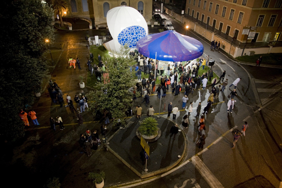
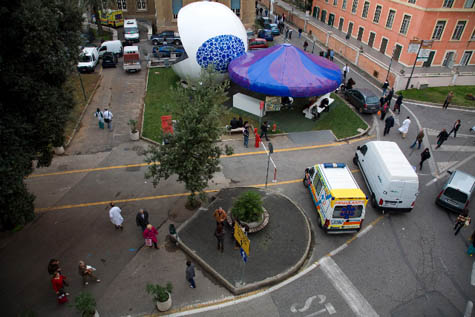 [Images: The Waiting Room, Rome, by Jeffrey Inaba/Inaba Projects].
The website for Enel Contemporanea adds that "[c]olours, lights, geometric shapes and various environmentally friendly elements" bring "an element of comfort to an architectural space normally seen as a temporary and highly emotional environment."
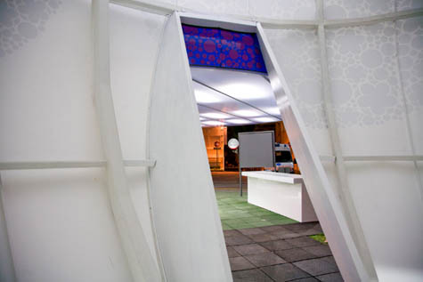

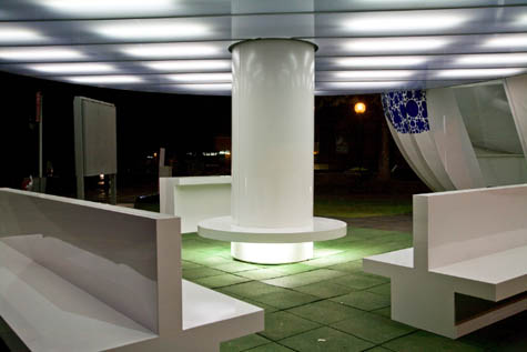
 [Images: The Waiting Room, Rome, by Jeffrey Inaba/Inaba Projects].
All of which is another way of saying that the project enlivens the experience of waiting inside architecture – highlighting the general but overlooked surreality of the waiting room, as a space in which you simply wait for something else to happen.
 [Image: The Waiting Room, Rome, by Jeffrey Inaba/Inaba Projects].
It's up until February 2009 – so if you're in Rome, check it out.
[Earlier on BLDGBLOG: Trash Mandala].



Comments are moderated.
If it's not spam, it will appear here shortly!
"this raises the possibility of a building so immersive, visually interesting, or simply distracting that you don't realize you're waiting for something.
...or a building so ugly you can't wait to run far, far away from it.
The building is unattractive, and there look like it would hold any warmth. No too friendly in winter...
The structure is nice..
So he designed a very, very ugly waiting room....wait, it is also solar powered... sorry i just don't see much in this.
It's perhaps ugly, perhaps not, it depends on the slickness of your mind. But the fact that photovoltaics can provide for a building structure to stand on its own is a pretty amaizing achievement.
what's the connection between alice in wonderland and pacman? i wish the designer came up with better narrative than that if this has to be claim its unattractiveness.
"It's perhaps ugly, perhaps not"
Sorry, no doubt about it. U-G-L-Y.
the world of waiting rooms surely needed more uncomfortable chairs and lovely fluorescent lights. yet the sick will benefit, pain drops in intensity if you manage to focus your attention on something else, and this place leaves enough to the imagination or curiosity of its users about its intentions.
Who are the two people in photo #11, dressed in identical day-glo jumpsuits? Are they municipal personnel? If I was hanging around that place and saw them come out, I'd think I was in Oompa-Loompa land.
Knowing Jeffrey, there are larger ideas at play than just what is presented or seen on the surface. His knowledge is vast and is used in the formulation of all of his work.
I appreciate that its design masks its function. It looks nothing like a waiting room. Elements of design and architecture that are this over-the-top and creative are exciting to see-- even if they are a little out of place. Bonus points for working in the green initiatives, too.
It looks so futuristic, and as others have said, icy cold...
...but my first thought was
'Wait, is that entire thing made of virgin plastics?' -
Not thinking too forward thinking on that front. More World's Fair 1939...
Architecture and Design are getting more and more advanced as science progresses. This is a very good article and full of information on this structure. Now, it would attract people's eye, I mean it is a pretty futuristic design and it seems it could be found in movies.
Personally, I don't buy it. As I understand it, the whole objective of the project was to rethink the waiting room...which is traditionally equipped with benches, overhead flourescent lighting, and a magazine rack.
To me, the photos of the interior appear just as sterile and lifeless as every-other waiting room. It's more of the same, Version 2.0, btw, it's emerged as plastic fungi and strapped with solar panels.
If one were to really rethink this problem of waiting, we might search for other spatial possibilities, for instance handing out pagers or GPS units to patients so they can go off an do as they please, check out a bookstore or head down to a bowling alley...eliminating the attachment to a specific place. The GPS units could also be recharged by solar power if that's what everyone is so excited about. [I grew up in a house that was mostly powered by polar panels, and that was the 80's, so I don't see all the excitement, it's old hat.]
Or perhaps they double as a game console so you can play Tetris off in the nearest coffee shop for 30 minutes.
Or maybe it's a nomadic waiting room, a minature version of the Archigram's walkng city. You check in at the front office, get your GPS pager, and they send you on a treasure hunt to find the waiting room. you get clues via google maps on the pager screen and go from clue to clue, occupying yourself with something completely different than outdated versions of sports illustrated and time magazine.
-while this last option is a bit unreasonable, if i'm waiting to find out if i have cancer or aids, i'd rather be spending my precious time doing SOMETHING other than gobbing over some hideous illustrator graphics on a pac-man.---If architecture is about spatial relationships, I see these propositions actually challenging the current protocols of the waiting room. I mean, make it a maze or a labyrinth, but if you say that you are going to challenge it, I expect someone as recognized as J. Inaba to deliver something a bit more confrontational, especially in a speculative project such as this.
--Also, with a GPS/Google Maps interface, one could tag all the places they go and the things that they did while "waiting." The data would be built up as a palimpsest of waiting, a working document and history of all the patients, their lives, desires, illnesses, feelings, hopes, and aspirations. They could have camera-phone capabilities, able to upload their waiting experience as a set on a flickr database. When the doc calls you, play time is over.
Post a Comment