|
|
In what would merely have been an article about camping equipment in almost any other situation, revamped Italian architecture magazine Abitare recently took a fascinating look at portable mountain climbing shelters. 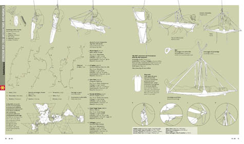 [Image: From an article by Jonathan Olivares, in Abitare; view much larger!]. [Image: From an article by Jonathan Olivares, in Abitare; view much larger!].Viewed architecturally, these examples of high-tech camping gear – capable of housing small groups of people on the vertical sides of cliffs, as if bolted into the sky – begin to look like something dreamed up by Archigram: nomadic, modular, and easy to assemble even in wildly non-urban circumstances. This is tactical gear for the spatial expansion of private leisure. There are about a million implications here – including, at the very least, the question of whether or not architects should be involved in designing tents for North Face or for REI. If Zaha Hadid can design desk lamps and Frank Gehry, jewelry – and Michael Graves, teapots – then why can't, say, Jean Nouvel design a new series of outdoor recreational equipment, including tents, portaledges, platforms, and hammocks? In fact, Jonathan Olivares, the author of the piece, describes the invention of the portaledge as follows: "Drawing from hammocks, cots, tents and sail construction, a generation of climber-designers invented a new typology: the portaledge." As such, the portaledge already has a fascinating design genealogy – one that includes the B.A.T. tent, the LURP, so-called "Cliff Dwellings" equipment, and tube-framed, waterproof tepees – but get some architects involved with this and see what happens. Unless, of course, this is yet another case where architects have fallen behind the other design fields, too obsessed with accurately quoting Gilles Deleuze to notice that the world has been revolutionized. All sorts of amazing new tools, techniques, materials, shapes, and spaces were being framed and even mass-manufactured out there, for decades, but architects were all cooped up, underlining things for each other in the library. 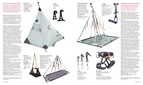 [Image: Another spread from Abitare, an article by Jonathan Olivares; view larger!]. [Image: Another spread from Abitare, an article by Jonathan Olivares; view larger!].In any case, I suppose one could say that this tent, below, the Dyad 22 by North Face, looks vaguely like some sort of microlight architectural folly designed by Neil Denari for the beaches of Southern California –  [Image: The Dyad 22 by North Face]. [Image: The Dyad 22 by North Face].– and these tents, the Domes 5 and 8, also by North Face, look like, say, Buckminster Fuller in collaboration with Shigeru Ban. Or: if Buckminster Fuller and Shigeru Ban came together to franchise the design of London's Serpentine Pavilion one summer, perhaps this is what they would make. Leading to the question: are tents an example of franchise architecture?  [Image: The Dome 5 and Dome 8 by North Face]. [Image: The Dome 5 and Dome 8 by North Face].So why aren't architects involved, as far as I'm aware, in the portable, modular architecture market known as high-end camping gear? You ascend to the top of Mt. Everest... sleeping in a tent by Greg Lynn. Your sleeping bag is by OMA. Your best friend is comfortably slumbering beside you in a tent designed by LOT-EK. 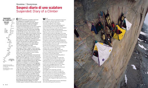 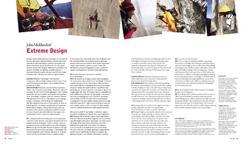 [Images: Two spreads from Abitare; view larger: top and bottom]. [Images: Two spreads from Abitare; view larger: top and bottom].But Abitare's article also implies something like the opposite of what I've written above: in other words, if high-tech camping gear used for vertical mountain ascents is actually a form of architectural technology, and thus worthy of being covered and critiqued by architecture magazines, then architects themselves should find more uses for such gear in their designs. Rather than design camping gear, then, they should design with camping gear, filling private homes and office high-rises with unexpected tent-like rooms and rapidly deployed nylon conference facilities. You carry your boardroom around in your briefcase, installing it up on the roof when summer allows. Or, perhaps, you construct a 21-story bare steel frame somewhere on an empty lot in New York City. It has no walls or floors; it is just a vast and abstract grid of I-beams, welded throughout with anchorage points. Using portaledges and tents, the inhabitants of this empty frame, like people from a fever dream by Yona Friedman or Constant, come in and colonize the structure, installing themselves at odd angles with carabiners and clips, bungee cords and tactical ropes, paying rent only on the spatial volume that the resulting structures occupy. $10 per cubic foot. The grid – the structure – is taken care of. Architecture becomes nothing but the process of designing better tents. Flexible interiors. Sewn space. So is high-tech 21st century camping gear exactly what the 1960s architectural avant-garde had been looking for? The portaledge as vertical utopia. 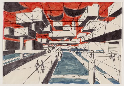 [Image: Spatial City by Yona Friedman: "The framework was to be erected first, and the residences conceived and built by the inhabitants inserted into the voids of the structure." Courtesy of the Museum of Modern Art]. [Image: Spatial City by Yona Friedman: "The framework was to be erected first, and the residences conceived and built by the inhabitants inserted into the voids of the structure." Courtesy of the Museum of Modern Art].To a certain extent, though, this reminds me of my experience just last week as a judge for the Design Village 2008: Mission to Mars competition, photographs of which can be found here. With some obvious exceptions, that contest gave us the tent as avant-garde – and even extra-planetary – architecture. In one case, it was the tent as full-fledged micronation, flirting with new definitions of political sovereignty. Perhaps 2009 will be the year tent design explodes across architecture schools, worldwide. Given zero insurance liability, then, could you arrange for a new, annual architecture competition, sponsored by REI, the point of which is to ascend Yosemite's Half Dome or El Capitan using only home-made, microlight portaledge technology? If you fall, you lose. You have to make it to the top within seven days – and you have to stay there for another three. Then you have to make it back down. 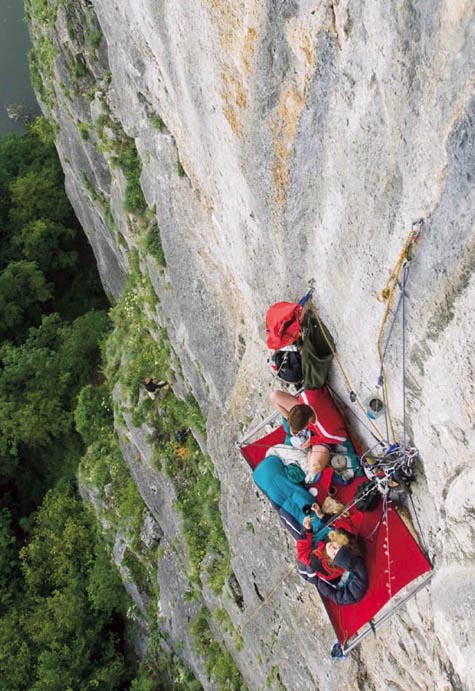 [Image: From Abitare; view larger]. [Image: From Abitare; view larger].All these instant cities of tents and portaledges, moving up and down mountainsides around the world, like Walking Cities, the urban condition gone nomadic – the new, vertical suburb, till now so architecturally underexplored. (Original articles curated by Anniina Koivu. With huge thanks to Fabrizio Gallanti from Abitare for emailing me the page spreads!)
In David Toop's classic book Ocean of Sound – something I cite repeatedly here on BLDGBLOG – we read about a musical performance that, by accident of circumstance, became a process of turning off all sources of noise within a building. 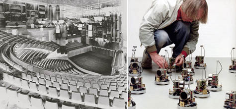 [Image: Felix Hess assembles similar sound machines, next to a photo of an unrelated concert hall]. [Image: Felix Hess assembles similar sound machines, next to a photo of an unrelated concert hall].For an installation of fifty specially made "sound creatures" – little interactive robots "inspired by the communication eco-system of frog choruses," Toop writes – experimental musician Felix Hess insisted that there be no "extraneous sounds" in the concert hall. Hess's miniature sound performance required absolute silence, or else the machines would not function. Toop then quotes a lengthy description of the creatures' set-up: We had imagined that the foyer, on an afternoon when nothing was being held there, was extremely tranquil, but not even one of them began to call out in response to any of the others. So first we turned off the air conditioner in the room, and then we turned off the one on the second floor. Then we turned off the refrigerator and the electric cooking equipment in the adjoining cafe, the power of the multi-vision in the foyer, and the power of the vending machine in a space about ten metres away. One by one we took away these continual noises, which together created a kind of drone there... Hess was very interested in this and said things like, "From now on maybe I should do a performance of turning off sounds." It's amazing to think, of course, that anything could pick up, and even respond to, sounds that subtle; but it's also quite incredible to imagine one's own acoustic awareness of architecture as a process of subtraction. You could even turn it into a game: 1) You are sitting on a stage, wearing a blind-fold.
2) Every electrical device in the building around you is on.
3) Suddenly, you detect a slight difference, a vague change in sonic pressure somewhere, as if an extremely distant mosquito has been swatted – a spot of silence, as it were, has appeared in the room.
4) "Toaster, fourth floor!" you call out – and you're right. Someone turned off the toaster.
5) You win a trip to France. In any case, it's easy to imagine Hess and his assistants finding this process much more difficult than they'd imagined. At one point in the afternoon, then, with only hours to go before the doors open, they have to step across the street and turn off the appliances in a nearby high-rise – and then next door, to a block of flats, and then down the road to the neighborhood hospital. Still nothing. Gradually they go on to turn off the entire world, street by street, city by city, in an ever-expanding ring of total silence. The world becomes a sonic sculpture from which sources of background sound are constantly removed. Finally, twenty-five years from now, as the very last radio is unplugged in a distant house in Tanzania, the "sound creatures" sitting with Felix Hess on stage begin singing.
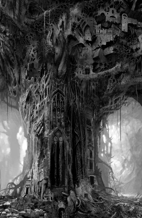 [Image: Daniel Dociu. View larger! This and all images below are Guild Wars content and materials, and are trademarks and/or copyrights of ArenaNet, Inc. and/or NCsoft Corporation, and are used with permission; all rights reserved]. [Image: Daniel Dociu. View larger! This and all images below are Guild Wars content and materials, and are trademarks and/or copyrights of ArenaNet, Inc. and/or NCsoft Corporation, and are used with permission; all rights reserved].Seattle-based concept artist Daniel Dociu is Chief Art Director for ArenaNet, the North American wing of NCSoft, an online game developer with headquarters in Seoul. Most notably, Dociu heads up the production of game environments for Guild Wars – to which GameSpot gave 9.2 out of 10, specifically citing the game's "gorgeous graphics" and its "richly detailed and shockingly gigantic" world. Dociu has previously worked with Electronic Arts; he has an M.A. in industrial design; and he won both Gold and Silver medals for Concept Art at this year's Spectrum awards. To date, BLDGBLOG has spoken with novelists, film editors, musicians, architects, photographers, historians, and urban theorists, among others, to see how architecture and the built environment have been used, understood, or completely reimagined from within those disciplines – but coverage of game design is something in which this site has fallen woefully short. 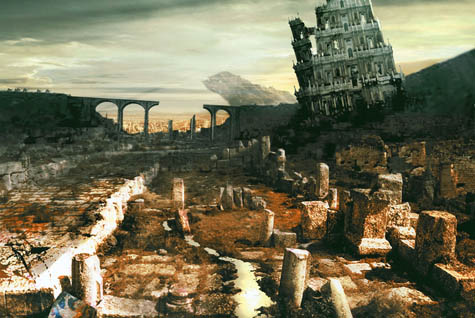 [Image: Daniel Dociu; view larger!]. [Image: Daniel Dociu; view larger!].So when I first saw Daniel Dociu's work I decided to get in touch with him, and to ask him some questions about architecture, landscape design, and the creation of detailed online environments for games. For instance, are there specific architects, historical eras, or urban designers who have inspired Dociu's work? What about vice versa: could Dociu's own beautifully rendered take on the built environment, however fantastical it might be, have something to teach today's architecture schools? How does the game design process differ from – or perhaps resemble – that of producing "real" cities and buildings? Of course, there are many types of games, and many types of game environments. The present interview focuses quite clearly on fantasy – and it does so not from the perspective of game play or of programming but from the visual perspective of architectural design. After all, if Dociu's buildings and landscapes are spaces that tens of thousands of people have experienced – far more than will ever experience whatever new home is featured in starchitects' renderings cut and pasted from blog to blog this week – then surely they, too, should be subject to architectural discussion?  [Image: Daniel Dociu; view larger!]. [Image: Daniel Dociu; view larger!].Further, at what point in the design process do architects themselves begin to consider action and narrative development – and would games be a viable way for them to explore the social use of their own later spaces? What would a game environment designed by Rem Koolhaas, or Zaha Hadid, or FAT really look like – and could video games be an interesting next step for professional architectural portfolios? You want to see someone's buildings – but you don't look at a book, or at a PDF, or at a Flickr set of JPGs: you instead enter an entire game world, stocked only with spaces those architects have created. Richard Rogers is hired to design Grand Theft Auto: South London. Of course, these questions go far beyond the scope of this interview – but such a discussion would be well worth having. 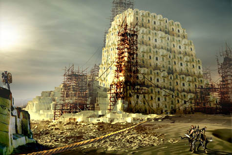 [Image: Daniel Dociu; view larger!]. [Image: Daniel Dociu; view larger!].What appears below is an edited transcript of a conversation I had with Daniel Dociu about his work, and about the architecture of game design. • • •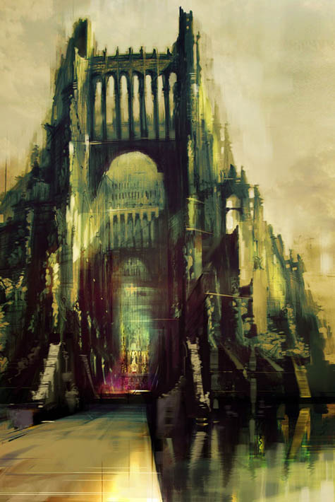 [Image: Daniel Dociu; view larger!].BLDGBLOG [Image: Daniel Dociu; view larger!].BLDGBLOG: First, I'd love to hear where you look for inspiration or ideas when you sit down to work on a project. Do you look at different eras of architecture, or at specific buildings, or books, or paintings – even other video games? Daniel Dociu: Anything but video games! [ laughs] I don't want to copy anybody else. Architecture has always made a strong impression on me – though I can't think of one particular style or era or architect where I would say: "This is it. This is the one and only influence that I'll let seep into my work." Rather, I just sort of store in my memory everything that has ever made an impression on me, and I let it simmer there and blend with everything else. Eventually some things will resurface and come back, depending on the particular assignment I'm working on. But I look back all the way to the dawn of mankind: to ruins, and Greek architecture, and Mycenean architecture, all the way up to the architecture of the Crusades, and castles in North Africa, and the Romanesque and Gothic and Baroque and Rococo – even to neo-Classical and art deco and Bauhaus and Modernist. I mean, there are bits and pieces here and there that make a strong impression on me, and I blend them – but that's the beauty of games. You don't have to be stylistically pure, or even coherent. You can afford a certain eclecticism to your work. It's a more forgiving medium. I can blend elements from the Potala Palace in Tibet with, say, La Sagrada Família, Antoni Gaudí's cathedral. I really take a lot of liberties with whatever I can use, wherever I can find it. 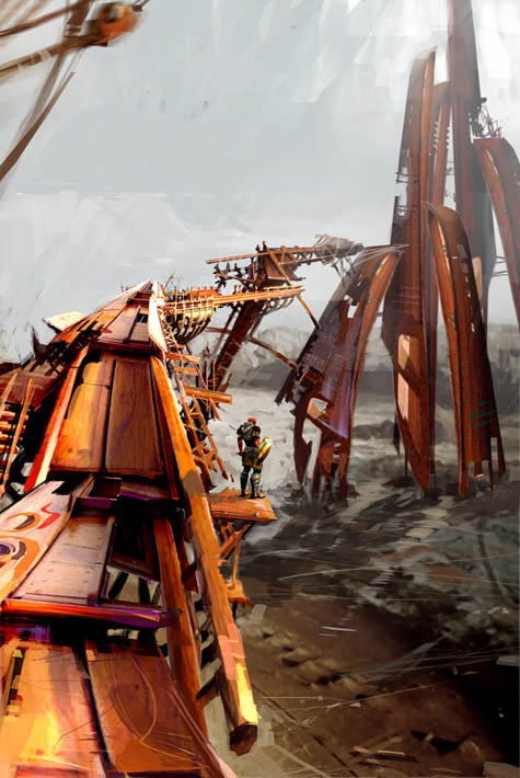 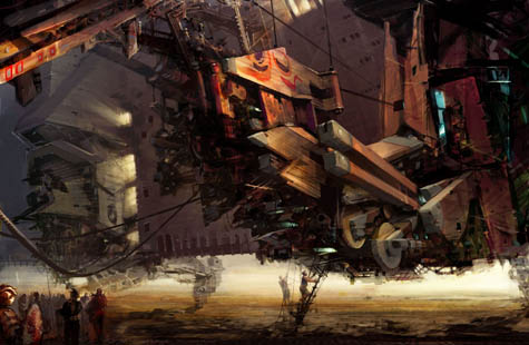 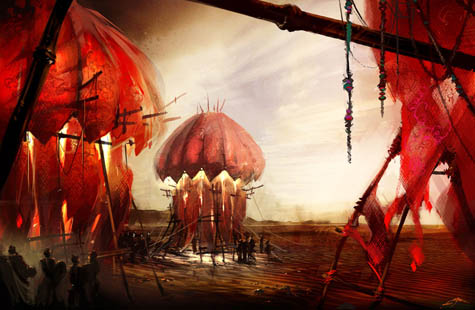 [Images: Daniel Dociu; view larger: top, middle, and bottom].BLDGBLOG [Images: Daniel Dociu; view larger: top, middle, and bottom].BLDGBLOG: Of course, if you were an architecture student and you started to design buildings that looked like Gothic cathedrals crossed with the Bauhaus, everybody outside of architecture school might love it, but inside your studio – Dociu: You'd be crucified! [ laughs] 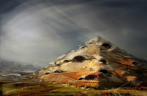 [Image: Daniel Dociu; larger!].BLDGBLOG [Image: Daniel Dociu; larger!].BLDGBLOG: No one would take you seriously. It'd be considered unimaginative – even kitsch. Dociu: Absolutely. That's probably why I chose to work in this field. There's just so much creative freedom. I mean, sure, you do compromise and you do tailor your ideas, and the scope of your design, to the needs of the product – but, still, there's a lot of room to push. 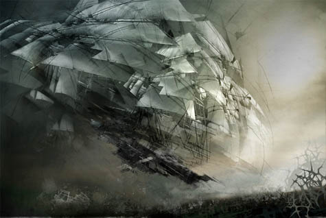 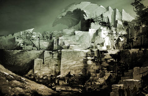 [Images: Daniel Dociu; view larger: top and bottom].BLDGBLOG [Images: Daniel Dociu; view larger: top and bottom].BLDGBLOG: So how much description are you actually given? When someone comes to you and says, "I need a mine, or a mountain, or a medieval city" – how much detail do they really give before you have to start designing? Dociu: That's about the amount of information I get. Game designers lay things out according to approximate locations – this tribe goes here, this tribe goes there, we need a village here, we need an extra reason for a conflict along this line, or a natural barrier here, whether it's a river or a mountain, or we need an artificial barrier or a bridge. That's pretty much the level at which I prefer for them to give me input, and I take it from there. Most of my work recently has been focusing around environments and unique spaces that fulfill whatever the game play requires – providing a memorable background for that experience. 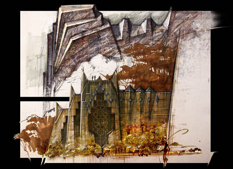 [Image: Daniel Dociu; view larger!].BLDGBLOG [Image: Daniel Dociu; view larger!].BLDGBLOG: So somebody just says, "we need a castle," and you go design it? Dociu: Usually I don't put pen to paper, figuratively speaking, until I have an idea. I don't believe in just doodling and hoping for things to happen. More often than not, I think about a sentiment or an emotion that I'm trying to capture with an environment – and then I go back in my mind through images or places that have made a strong impression on me, and I see if anything resonates. I then start doing research along those lines. Only once did I have a pretty strong formal solution – an actual design or spatial relationship, an architectural arrangement of the elements – before that emotion crystallized. But do I want something to be awe-inspiring, daunting, unnerving? That's what I work on first – to have that sentiment clarify itself. I don't start just playing with shapes to see what might result. Most of my work is pretty simple, so clarity and simplicity is important to me; my ideas aren't very sophisticated, as far as requiring complex technical solutions. They're pretty simple. I try to achieve emotional impact through rather simple means. 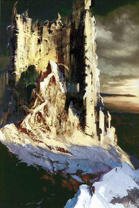 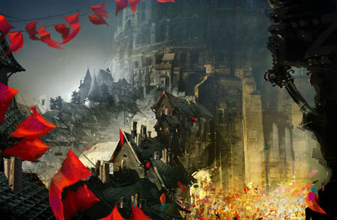 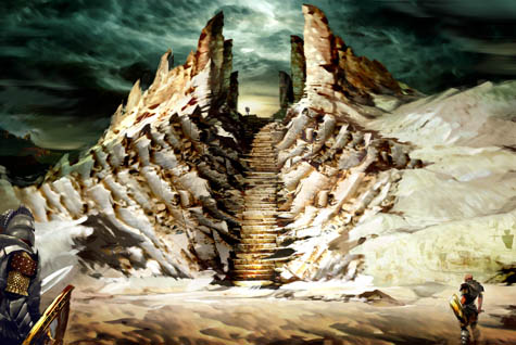 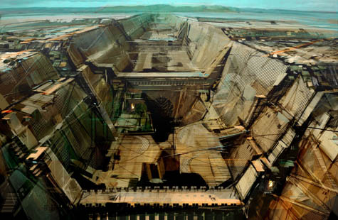 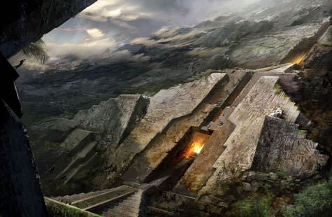 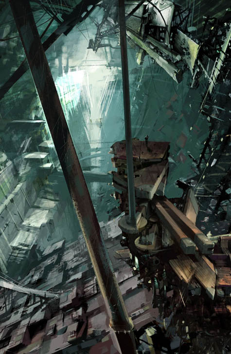 [Images: Daniel Dociu; view larger: one, two, three, four, five, and six].BLDGBLOG [Images: Daniel Dociu; view larger: one, two, three, four, five, and six].BLDGBLOG: Do you ever find that you've designed something where the architecture itself sort of has its own logic – but the logic of the game calls for something else? So you have to design against your own sense of the design for the sake of game play? Dociu: Oh, absolutely – more often than not. To make an environment work for a game, you have to redesign your work – and I do sometimes feel bad about the missed opportunities. These may not be ideas that would necessarily make great architecture in real life, but these ideas often take a more uncompromising form – a more pure form – before you have to change them. When these environments need to be adapted to the game, they lose some of that impact. 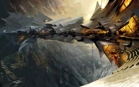 [Image: Daniel Dociu; view larger!].BLDGBLOG [Image: Daniel Dociu; view larger!].BLDGBLOG: I'd love to focus on a few specific images now, to hear what went into them – both conceptually and technically. For instance, the image I'm looking at here is called Skybridge. Could you tell me a little bit more about that? Dociu: Sure. The request there was for a tribe that's been trying to isolate itself from the conflict, and the tensions, and the political unrest of the world around it. So they find this canyon in the mountains – and I was picturing the mountains kind of like the Andes: really steep and shard-like. They pick one of these canyons and they build a structure that's floating above the valley below – to physically remove themselves from the world. That was the premise. I wanted a structure that looked light and airy, as if it's trying to float, and I chose the shapes you see for their wing-like quality. Everything is very thin, supported by a rather minimalist structure of cables. It's supposed to be the habitat for an entire tribe that chooses to detach themselves from society, as much as they can. 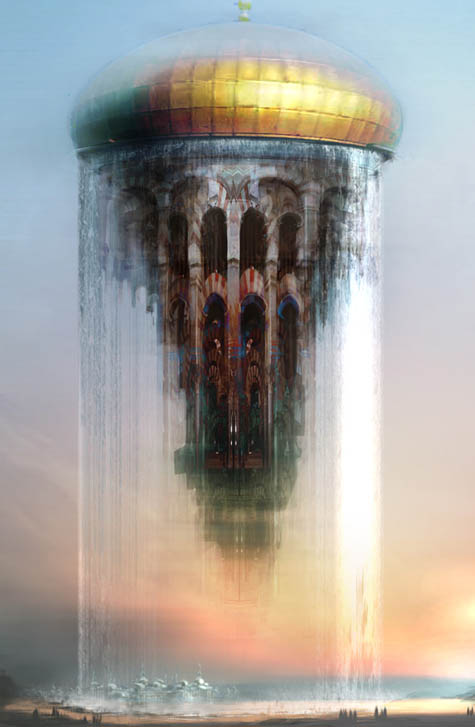 [Image: Daniel Dociu; view larger!].BLDGBLOG [Image: Daniel Dociu; view larger!].BLDGBLOG: You've designed a lot of structures in the sky, like airborne utopias – for instance, the Floating Mosque and the Floating Temple. Was there a similar concept behind those images? Dociu: Well, yes and no. The reasons behind those examples were quite different. First, floating mosques were my attempt to deal with what is a rather obnoxious cliché in games – which is floating castles. Every game has a floating castle. You know, I really hate that! 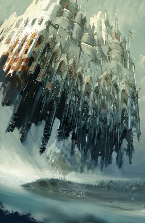 [Image: Daniel Dociu; view larger!].BLDGBLOG [Image: Daniel Dociu; view larger!].BLDGBLOG: [ laughs] So these are actually your way of dealing with a game design cliché? Dociu: I was trying to find a somewhat elegant and satisfying solution to an uninteresting request. 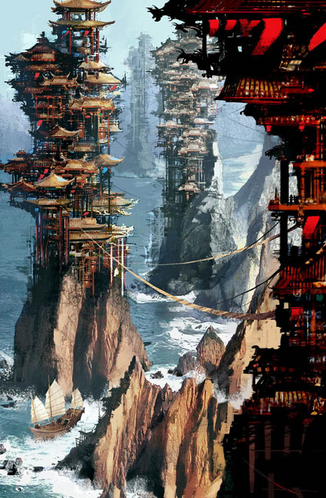 [Image: Daniel Dociu; view larger!].BLDGBLOG [Image: Daniel Dociu; view larger!].BLDGBLOG: And what about Pagodas? Dociu: The story there was that this was a city for the elite. It was built in a pool of water and it was surrounded by desert. Water is in really high demand in this world, but these guys are kind of controlling the water supply. The real estate on these rock formations is limited, though, so they were forced to build vertically and use every inch of rock to anchor their structures. So it's about people over-building, and about clinging onto resources, and about greed. That doesn't touch on the game in its entirety – but that's the story behind the image.  [Image: Daniel Dociu; view larger!].BLDGBLOG [Image: Daniel Dociu; view larger!].BLDGBLOG: Finally, what about the Petrified Tree? Dociu: That was part of another chapter in our game. We thought that there should be some kind of cataclysm – or an event, a curse – that turns the oceans into jade and the forests into stone. We had nomads traveling the jade sea in these big contraptions, like machines. So the petrified forest was a gigantic forest that got turned into stone, and the people who were happily inhabiting that forest had to find ways to carve dwellings into the trees: different ways of shaping the natural stone formations and giving them some kind of functionality – arches, bridges, dwellings, and so on and so forth. It was a blend of organic and manmade structures. At that particular point in time, quite a few of my pieces were the result of my fascination with the Walled City of Kowloon. I was really sad to see that demolished, and this was kind of my desperate attempt to hold onto it! I was incorporating that sensibility into a lot of my pieces, knowing it was going to be gone for good. 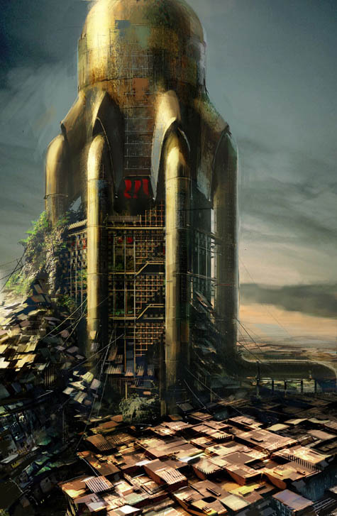 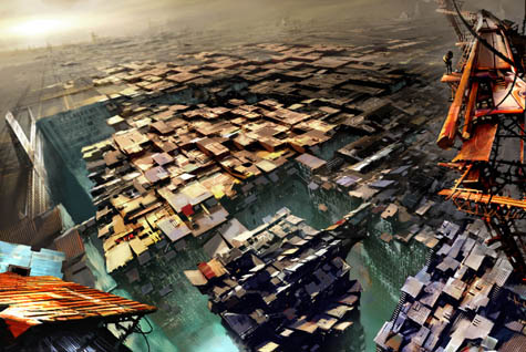 [Images: Daniel Dociu; view larger: top and bottom].• • • [Images: Daniel Dociu; view larger: top and bottom].• • •Thanks again to Daniel Dociu for taking the time to have this conversation. Meanwhile, many, many more images are available on his website – and in this Flickr set. 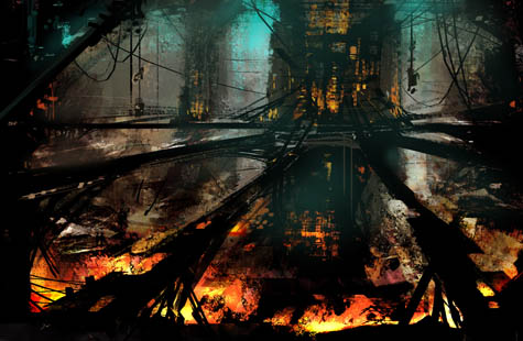 [Image: Daniel Dociu; view larger!].(Daniel Dociu's work originally spotted on io9). [Image: Daniel Dociu; view larger!].(Daniel Dociu's work originally spotted on io9).
 [Image: Ice in Cranberry Lake, Ontario, photographed by Michael Runtz; via New Scientist]. [Image: Ice in Cranberry Lake, Ontario, photographed by Michael Runtz; via New Scientist].
 [Image: From Sinai Hotels, by Sabine Haubitz and Stefanie Zoche of Haubitz+Zoche]. [Image: From Sinai Hotels, by Sabine Haubitz and Stefanie Zoche of Haubitz+Zoche].
Vienna's Architekturzentrum will be hosting a new photography show, opening this Wednesday, April 24, called Sinai Hotels.
With images by Sabine Haubitz and Stefanie Zoche of Haubitz+Zoche, the show looks at "the concrete skeletons of five-star hotel complexes" abandoned on Egypt's Sinai Peninsula.
They are resorts that never quite happened, then, with names like Sultan's Palace and the Magic Life Imperial. This makes them "monuments to failed investment."
  [Images: From Sinai Hotels, by Sabine Haubitz and Stefanie Zoche of Haubitz+Zoche]. [Images: From Sinai Hotels, by Sabine Haubitz and Stefanie Zoche of Haubitz+Zoche].
The hotels now look more like "architectonic sculptures" in the desert, the photographers claim, or derelict abstractions, as if some aging and half-crazed billionaire had constructed an eccentric sculpture park for himself amongst the dunes.
   [Images: From Sinai Hotels, by Sabine Haubitz and Stefanie Zoche of Haubitz+Zoche]. [Images: From Sinai Hotels, by Sabine Haubitz and Stefanie Zoche of Haubitz+Zoche].
The billionaire goes for long walks at night alone amongst the ruins, sweeping dust from recent sandstorms off windowsills and open doorways.
At night, when the stars come out, different constellations are framed by unglazed windows, as if justifying these concrete forms from above with the poetic force of celestial geometry.
  [Image: From Sinai Hotels, by Sabine Haubitz and Stefanie Zoche of Haubitz+Zoche]. [Image: From Sinai Hotels, by Sabine Haubitz and Stefanie Zoche of Haubitz+Zoche].
Or, for that matter, five years from now these deserted monuments simply disappear – but because they've been put to use, finally, enwrapped with drywall and plaster, fitted out with drapes and marble floors, and you can sleep inside them for $300 a night, never even dreaming that these hotels were once ruins, temporarily abandoned to the sand and only recently reclaimed.
The empty swimming pool is now full – and you dive into it, unaware that you're more like a ghost than a tourist, haunting the afterlife of these sites in bleaching sunlight.
 I've been going through old magazines to find articles that I hope to read, re-read, or even incorporate into the final edits of the BLDGBLOG Book – and so tonight I came across the January 2007 issue of Metropolis. There, we read about the ten greatest engineering feats of architectural history – including this short blurb about Hagia Sophia, in Istanbul: The building was constructed of masonry, which shifted constantly during construction and thereafter. Today we use "switch-on gravity analysis," where we imagine a structure built on the Moon and then digitally move it over to the Earth in a fraction of a second, and suddenly it's loaded. But a structure like this changed its characteristics during construction, almost minute by minute. I can't image [sic] how people could have had the courage to construct it. It's fascinating to think that the very thing under construction is in the process of altering itself. The structure has taken on agency, in other words: moving, shifting, becoming something other than what you intended it to be. That which you add to, shifts; that which supports you, changes. At the end, then, perhaps we'll all look down at our own foundations, at the walls and arches below us, as if to reassure ourselves, to remember who we were, how we got here, and who we once thought we could be – but our foundations will be defaced or gone. The past has "changed its characteristics during construction, almost minute by minute" – and so we're stranded, over a void, our feet firmly planted on nothing. The only answer, then, will be to keep building up, to go out, to resist the nostalgic pull of foundations, seeking overwhelming extremes of both altitude and complication. Perhaps we'll then forget, in a state of self-induced vertigo, that we once needed a past at all – and that the building in which we now stand had a plan, a plan the building itself had always been exceeding.
 Tomorrow I'll be down in San Luis Obispo, helping to judge a competition called Design Village 2008: In the Design Village Competition, teams from across the United States design and build a theme-based structure that meets several additional requirements: the structure's parts must be hand carried down a mile trail into the canyon; the structure must be assembled in 12 hours, without the use of plugged electricity; the team members must live in their structure for the entire weekend. The theme this year is Mission To Mars. Here is a gallery of previous contestants. I think it's open to the public, as well – so, if you're in the central coast region, come by, say hello, check out all the structures, and keep your fingers crossed for good weather.
 [Image: A flying logo, or Flogo]. [Image: A flying logo, or Flogo].Over on LiveScience we learn that a new company has started using "a mixture of soap-based foams and lighter-than-air gases such as helium" to create "floating ads and messages" in the sky. Unfortunately dubbed Flogos, these floating logos can be made – or printed, really – every 15 seconds by "re-purposed snow machines," thus "flooding the air with foamy peace signs or whatever shape a client desires. Renting the machine for a day starts out at a cost of about $2,500." I should start blogging with it. The sky texts aren't particularly large, however. They're only "about two feet long and nearly a foot wide" – but they "generally last anywhere from a few minutes to an hour, depending on conditions in the atmosphere." "They will fly for miles," their inventor adds – because they are "durable," capable of flying as high as 20,000 feet without breaking up. Gaseous typography. It won't just be meteorologists watching the skies, in other words, but graphic designers. Adjusting leading, kerning the clouds, ragging atmospheres. And what about abstract typography – printing random cloud-shapes on a massive scale? Future paranoias appear in the diagnostic handbooks of tomorrow's most expensive psychiatrists. Patients stumble in, demanding to know if those clouds are really signs... And, if so, who put them there, what they say – and what about that one... Flying through these atmospheric print-outs, meanwhile, is "like going through a cloud" – and thus, apparently, safe. Just a minor bit of literary turbulence as you pass through a challenging paragraph. But this ability to print aerial images also hints at what could be called the immersive sky-cinema of tomorrow: you get into the cockpit of a small airplane and you fly through artificial clouds – clouds that have been printed to look like a sequence of animated cells. You proceed to fly through this cloud-by-cloud narrative, perhaps even reading word bubbles and thought balloons – subtitles – or you play a carefully synched soundtrack on your iPod. Soon, you can leave commentary in the air with your own re-purposed snow machine. Metacommentary. Footnotes. Or perhaps music written in the sky + a local radio station playing that song = SkyKaraoke™. In any case, I originally saw this bit of news on MetaFilter – where we also find a link to an article published in the New York Times back in 1892. Here it is as a PDF and as a JPG.  [Image: From an article published in 1892 in the New York Times. Read as PDF or JPG]. [Image: From an article published in 1892 in the New York Times. Read as PDF or JPG].Apparently documenting the very birth of skywriting – that "interesting experiment" of typesetting the sky – the article relates what it describes as the "curious effect" of seeing letters and signs mid-air. Clouds of steam become a new textual presence in space. In any case, there is an obvious (and, frankly, rather uninteresting) reaction to all this – i.e. please save us from yet another form of corporate advertising, we don't need logos in the sky – but there are also artistic, and even literary, implications here that go beyond mere outrage.  1) 1) If you put this into the context of weather control as an emerging technique for urban design – for instance, what we're seeing in Beijing with the Olympics – then these sorts of cloud-printing techniques open up a whole new front in any serious discussion of public space and the city. The question here might be: what are the political and/or municipal implications of being able to typographically format the skies? I'm reminded of Roberto Bolaño's novel Distant Star, in which a Nazi-sympathizing South American poet turns to skywriting, putting his poems in the clouds after a right-wing coup d'état, scrawling three-dimensional diatribes in the subtropical air. 2) If graphic design suddenly becomes atmospherically relevant, so to speak, will we someday read an issue of PRINT or an essay on Design Observer about well-rounded cloud forms – how, perhaps, the skies above Amsterdam are beautifully sans serif, whilst the skies of Rome are well-paragraphed but poorly spaced...? Then you play an April Fool's joke: you send a design critic to some city where they don't print the clouds at all – but you ask him or her to critique their newest font... Six pages of embarrassing sky criticism ensue. 3) If typography also bears information, of course, then perhaps tomorrow's literature will be skybound, no longer bound in books. Penguin's UK-based We Tell Stories initiative abandons the internet entirely to print stories in the skies above Bloomsbury or Liverpool or even Hay-on-Wye. Much was made years and years ago about William Gibson's self-erasing book Agrippa (A Book of the Dead), but why not repeat that performance with a book printed only once, in the air, off a dock on the east coast of England? It disperses across the Channel in a haze of typography – a particularly robust paragraph or two flying as far as Paris, where still intelligible letters float past the bedroom window of a 13 year-old hopeful game designer... who gets an idea.  4) 4) Perhaps we all really should give up internet-based blogging and switch instead to the sky. I could buy a small shack on a hill somewhere in Los Angeles and grow a beard. Turning my back on representational form, I'll emit abstractions of well-made foam into the sky on windy days. Air sculptures, like something by Marcel Duchamp, floating over parking lots and across the yards of the rich and famous. Harrison Ford is interviewed by Variety: "I saw very strange clouds last night," he says, still visibly stunned, his voice shaken. "They were made of foam – and they... they were really quite beautiful." 5) For the rest of human history, no one trusts the clouds. No one knows for sure if they are natural. Everything appears to be printed. Like those infamous numbers stations – radio broadcasts of uncertain origin which appear to be involved with international espionage – strange cloud forms seen over factories in Berlin are studied for their possible meanings. Cloud cryptography. An aerial Enigma machine. New political departments – combining handwriting analysis, graphic design, linguistics, meteorology, advanced statistics, and spycraft – are formed by governments all over the world. 24-hour surveillance of the skies ensues. (Via MetaFilter).
|
|
 [Image: From an article by Jonathan Olivares, in Abitare; view much larger!].
 [Image: Another spread from Abitare, an article by Jonathan Olivares; view larger!].
 [Image: The Dyad 22 by North Face].
 [Image: The Dome 5 and Dome 8 by North Face].
 [Images: Two spreads from Abitare; view larger: top and bottom].
 [Image: Spatial City by Yona Friedman: "The framework was to be erected first, and the residences conceived and built by the inhabitants inserted into the voids of the structure." Courtesy of the Museum of Modern Art].
 [Image: From Abitare; view larger].
 [Image: From an article by Jonathan Olivares, in Abitare; view much larger!].
 [Image: Another spread from Abitare, an article by Jonathan Olivares; view larger!].
 [Image: The Dyad 22 by North Face].
 [Image: The Dome 5 and Dome 8 by North Face].
 [Images: Two spreads from Abitare; view larger: top and bottom].
 [Image: Spatial City by Yona Friedman: "The framework was to be erected first, and the residences conceived and built by the inhabitants inserted into the voids of the structure." Courtesy of the Museum of Modern Art].
 [Image: From Abitare; view larger].
 [Image: Felix Hess assembles similar sound machines, next to a photo of an unrelated concert hall].
 [Image:
  [Image:
  [Image:
  [Image:
  [Image:

 [Images:
  [Image:
 [Images:
  [Image:


 [Images:
  [Image:
  [Image:
  [Image:
  [Image:
 [Images:
  [Image:
  [Image: Ice in Cranberry Lake, Ontario, photographed by Michael Runtz; via
  [Image: From
 [Images: From

 [Images: From
 [Image: From
  I've been going through old magazines to find articles that I hope to read, re-read, or even incorporate into the final edits of the BLDGBLOG Book – and so tonight I came across the January 2007 issue of
  Tomorrow I'll be down in San Luis Obispo, helping to judge a competition called
  [Image: A flying logo, or Flogo].
 [Image: From an article published in 1892 in the New York Times. Read as
  1) If you put this into the context of weather control as an emerging technique for urban design – for instance, what we're seeing in
  4) Perhaps we all really should give up internet-based blogging and switch instead to the sky. I could buy a small shack on a hill somewhere in Los Angeles and grow a beard. Turning my back on representational form, I'll emit abstractions of well-made foam into the sky on windy days. Air sculptures, like something by


