
Park's Parks
 [Image: "Daechi Dong," a photo by Hosang Park, from his series A Square].
Note: This is a guest post by Nicola Twilley.
Korean photographer Hosang Park's series A Square consists of bird's-eye views of the small, over-landscaped parks that seem to accompany modern apartment towers all over the world. As Park explains, these "parks" are too small to serve their ostensible purpose: as open space for recreation and places "to make discussions or take a rest." In the UK and US, they are included in new construction projects to fulfill the letter of planning regulations (if not the spirit) – a token band-aid of "nature" applied to high-density development. As Park points out, their presence in Korea is both a reassurance and an investment: the trees, paths, and water features, no matter how artificial, push up property prices by providing an implicit guarantee of "the environmental benefits of a place where they belong."

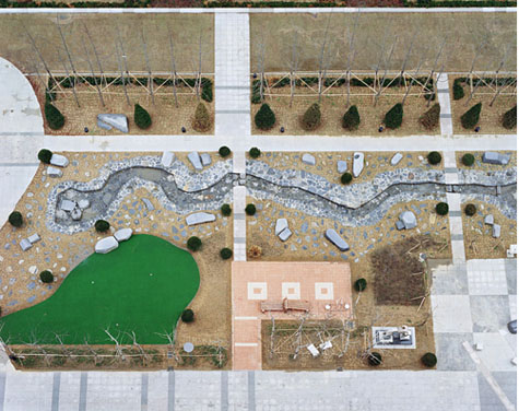
 [Images: "Howon Dong" and "Sinbong Dong 2," photos by Hosang Park, from his series A Square].
Park's parks are photographed from above – which seems, in fact, to be the view for which they were designed. As two-dimensional compositions of curved paths, colored paving, and rhythmically spaced rocks or trees, they resemble pleasing, if sterile, designs for wrapping paper or Ikea rugs. Tellingly, they are also completely empty. Park explains that he took these photos while he was living on the 13th floor of Jugong Apartment in Chang-dong, Seoul. He and his hundreds of neighbors experienced their park as a a patch of eye candy – visual respite from the concrete and tarmac of their surroundings. Its cornucopia of amenities – climbing frames, fountains, seesaws and swing sets, pagodas, grass, ornamental rocks, meandering paths, trees and flower beds, benches, ponds, basketball courts... even public art – are crammed together as visual shorthand for endless leisure. They are landscape as signage, a placeholder for the possibilities of a park.
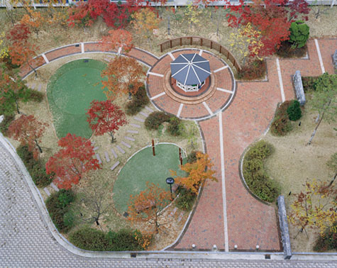
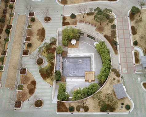
 [Images: "Samsung Dong" and "Uman Dong," photos by Hosang Park, from his series A Square].
But could we then imagine that Korea's urban landscape subcontractors have been applying the lessons of graphic design to their creations, as if to a poster or magazine spread? The spaces between ornamental planters are carefully kerned, the edges of flower beds masterfully shaped through ragging to create an "organic" appearance – each element ordered and constrained by a Tschicholdian grid. Or perhaps these parks are the work of one visionary landscape designer, a passionate disciple of Edward Tufte. His goal is the ultimate park infographic, and he diligently recombines ponds, benches, and pagodas to achieve ever greater data density that allow for ever more sophisticated landscape analyses. The published results will become the canonical park design text for a generation, changing public policy as effectively as John Snow's landmark cholera outbreak map of London once did.
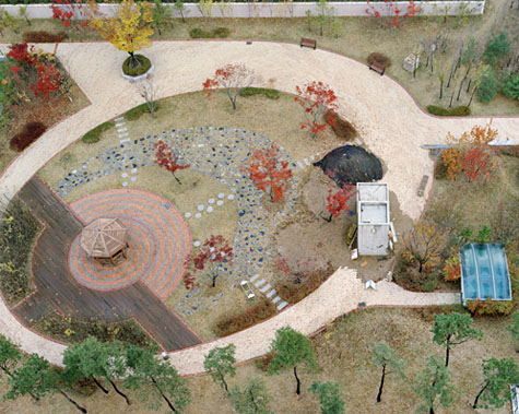
 [Image: "Sindorim Dong" by Hosang Park, from his series A Square].
Finally, I'm reminded of the Royal Horticultural Society's model gardens at Wisley. Wisley, an otherwise unremarkable village in Surrey, is home to an educational garden, meant to fulfill the Society's remit "to show to the public the best kinds of plants to grow." Behind the scenes at Wisley, fields are devoted to trialling difficult, delicate, or entirely new kinds of flowers, vegetables, and fruit for "garden or ornamental use." Teams of horticulturists partner with botanists, entomologists, and pathologists to determine the correct details, cultivation, and advice for each group of plants, with high performing plants winning an Award of Garden Merit (AGM) – the gardening equivalent of a Good Housekeeping Seal.

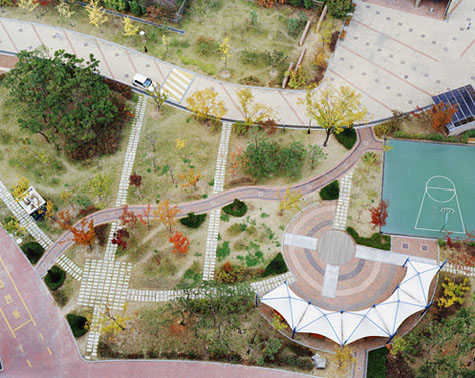
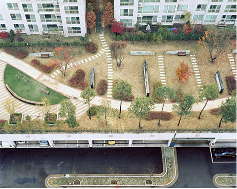 [Images: "Jangan Dong" and "Sinbong Dong," photos by Hosang Park, from his series A Square].
AGM-winning plants are then arranged in model gardens at Wisley, to which the public is invited to learn the ideal varietals, patterns, and conditions for a garden on chalky soil, say, or a poorly drained lot. These model gardens are not actually intended to be the private back yards they resemble; instead they are part-instruction manual, part-shop window, part prototype of future, unrealized landscapes elsewhere. Like Park's parks, they are primarily designed to be read, rather than sensed or experienced; and they are deliberately exhaustive in their approach, with each rather small plot landscaped to show all appropriate elements of, for instance, a sub-alpine rock garden. Which leads me to wonder if Park's photos have inadvertently documented an experimental array of urban test gardens, new spatial formats for high-density leisure in their beta phase.
(Hosang Park's work discovered via Flavorwire. Earlier posts by Nicola Twilley include Dark Sky Park and Zones of Exclusion).


Comments are moderated.
If it's not spam, it will appear here shortly!
Amazing! Looks like something I used to dream up as a child.
Hosang's work is so great! Thank you for picking up on it and writing about it here. He is a new Hot Shot so his work is on view at Jen Bekman Gallery, 6 Spring Street, through this Saturday. If you're in NYC, please stop by!
Something about these landscapes reminds me of Petra Blaisse's State Detention Centre in Utrecht. I'd link to images, but Inside/Outside have a flash based site. :(
Although they are pretty, I think that it would be fruitful for the designers to have paid some heed to the work of Aldo van Eyck, not on formal copying but in the basic foundations for which his designs rested upon.
One need not think of more playful parks as childlike, and pretty parks as desireable in and of themselves.
only .02
These are awful examples of parks - overcrowded with too much random stuff, and not enough green - lawn, hedges, or trees. They're all just too busy. Tear out half of the paths, and let them get a bit overgrown. Then they'll have some attraction.
Definitely these are built with an eye towards the letter of the law, and not the spirit, and it's no wonder they are entirely empty.
The one that seems to have something positive going for it, to me, is the last photo - where cars are peeking out under the edge of the park, at least getting some use out of the space.
The introductory observation that these parks have been planned to truly be read from an aerialized, graphic design perspective is telling. Many critics would chide such designs for not privileging the pedestrian experience. However, the Twilley makes an interesting point when she concludes with the question of if these could serve as visual tests in creating spaces of visual respite for high-rise dwellers. I am bit biased in thinking that this is really just "easy" / bad park design and not a more intentional effort to engage the distanced gaze of leisure.
Post a Comment