Shells, Tube Structures, and Minimal Surfaces
Reader Louis Schultz has pointed out the work of Lithuanian-born artist Aleksandra Kasuba, who used curved surfaces of fabric stretched and attached between space frames in order to create inhabitable rooms and corridors.
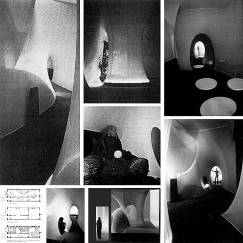
 [Images: The Live-in-Environment (1971) by Aleksandra Kasuba; the project "was built on a parlor floor of a brownstone house in New York City," we read. "The intent was to abolish the 90-degree angle and create an environment that would capture changes in daylight, provide variations in terrain, and introduce the unexpectedness of views found in nature without simulating nature"].
These ephemeral installations were intended, spatially, as a way to "abolish the 90-degree angle and create an environment that would capture changes in daylight, provide variations in terrain, and introduce the unexpectedness of views found in nature without simulating nature." I love that latter caveat: to retain the experiential impact of unexpected natural vistas without simply copying, or simulating, the spatial details and material palette of the natural world.
Instead, a somewhat stark world of undecorated surfaces curves around us – call it biomorphic minimalism – thus eliding the differences between architecture and large-scale tailoring.
In any case, her Live-in-Environment, from 1971, seen in the images above, is a great example of this – but don't miss the Roof Deck Study from 1974; the Barbarella-meets-IBM world of torqued geometry from her Office Renovation Study (1975); the aerial tunnels of Art-in-Science I (1977), which look like some megafaunic form of undersea life, stretched through the canopies of a North American thicket ("With the assistance of three students during an eight week stay," Kasuba writes, "we explored the topology of 78 fabric structures, hardened 32 with resins, and erected 4 weather structures"); and the simplicity of Blue Shade (1978).
Better yet, Kasuba supplies a section called How It Was Done – where you can learn how to create finishes, arches, and doors, for instance – and this includes Kasuba's extraordinary, lo-fi guide to shells, tube structures, and minimal surfaces.
It's what The North Face might have become had their tent division been bought by Kenneth Snelson.


Comments are moderated.
If it's not spam, it will appear here shortly!
That reminds me - in terms of shapes, rooms created with fabric, and the capture of daylight changes - of the luminarium installations of Architects of Air. We explored their Levity II during Birmingham ArtsFest 2007.
Elizabeth
Some of the gauzy(ness) of the B+W images remind me of Ernesto Neto's anthropodino,
I was thinking of Ernesto Neto too, images at armoryonpark.org or jamesewingphotography.com
-James
Indeed! Neto's piece and the Architects of Air both do have many similarities - thanks for the links.
Post a Comment