
On Publishing Student Work
Having arrived back in London to another massive stack of books, magazines, and other architectural publications – including one-off broadsides, pamphlets, and even a deck of urban-themed playing cards – I've been immersed in a sea of mind-bending spatial ideas.
This morning, I've been specifically thinking about the publication of student work, as I've (finally) been able to read through a recently published catalog of the Bartlett School of Architecture's 2009 school year.
 [Image: From Unit 23 at the Bartlett, taught by Bob Sheil and Emmanuel Vercruysse].
The book includes some amazing imagery and ideas – from a cantilevered "salt spa," by Janinder Bhatti, partially held up on shadow-casting stilts, to a "sailing school" proposed for a trans-continental urban site on the Bosphorus by Nicholas Elias, by way of a "landfill tower" for Manhattan designed by Gabriel Chung.
There are two entirely separate designs for blood banks (one in Brooklyn by Stefano Passeri and one on the U.S./Mexico border by Victor Hadjikyriaki); there are the extraordinary-sounding "archaeological prosthetics for the Schliemann excavations of Troy" by Fei Meng; there is an ingenious pitch for a "South African Land Registry and Claims Court," in the guise of exploring "political geology," by Joshua Scott; there is a "dissolvable pavilion" by Snow Cai, a "Museum of Dust" by Olivia Pearson, and a "Roosevelt Island Respiratory Clinic" by Chiara Montgomerie, all from Unit 8, taught by Johan Berglund and Rhys Cannon; there is a "flower therapy institute" by Sandra Youkhana; and there is something that I am dying to know more about, called "Pioneering Weather" by Martin Tang. This latter project appears to be a kind of nuclear-powered sky-alteration device, complete with conical cooling towers and a wharf-like extension, perhaps implying its use for coastal weather generation.
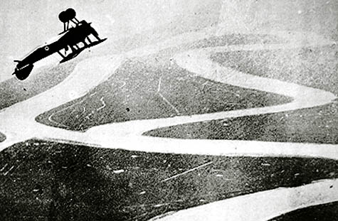
 [Image: Unidentified student work from Unit 15 at the Bartlett, taught by Nic Clear and Simon Kennedy].
However, I have to point out right away that the publication heavily over-prioritizes the instructors' own studio descriptions, giving, in almost all cases, no descriptions (sometimes not even a title) for the student work. When I say, above, that Martin Tang's project "appears to be" something, it is not because I didn't read the caption or because I don't want to repeat what Tang himself intended; it's because there is no textual explanation of what these student projects actually are (and the images themselves are too small to help).
In other words, we're given tantalizing imagery and the occasional project title – but that's it. In fact, this seems to be a trend in year-end school publications, and I think it's a bad one.
After all, when we see an extraordinary image for something called "Phileas Fogg's Orchestral Landscape," as designed by student Okan Kaleli, what exactly does this tell us? What is an "orchestral landscape," for instance, and how does this relate to the writings of Jules Verne? I would genuinely like to know – and I have a feeling that Kaleli would like to tell us.
Or, when we stumble upon an eye-popping collage of architectural sections by student Nancy NiBhriain, what exactly are we looking at? What is the story or idea behind the image?
One more example: one of the most complex 3D-printed objects I've seen in years – like some sort of nautiloid architectural structure as devised by H.R. Giger after spending two decades lost in the geometric depths of the Alhambra – is captioned simply as a project by Yousef Al-Mehdari (but what is it? what's the scale? did Al-Mehdari give it a title? or a story? is it meant for a certain site or purpose? is it a prototype? is it 3D-printed at all?). Readers like myself – and, I have to imagine, these students – are left frustratingly curious as to what it is that actually occurred inside that studio.
It is sadly the case that year-end school catalogs like these are the only times that many of these students' work will ever be published, and so it would be nice – if not emotionally important – even to see short, 50-word descriptions of each project.
After all, these students have worked their asses off for years now, and they deserve the exposure.
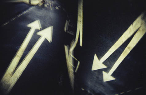 [Image: From Unit 21 at the Bartlett, taught by Christine Hawley, A. Ashton, and A. Porter].
Commendably, the instructors of 2009's Unit 14 – Stephen Gage, Phil Ayres, and Richard Roberts – do exactly this, including short descriptions of each image; and, as a reader, I hugely appreciate it.
For instance, we read: "Max Pringle, Wearable Buildings: Max is following a long standing interest in the boundaries between architecture, furniture design and fashion. This project is part of a 'collection' that proposes a wearable table cloth that is shared between two people." Or this: "Sam McElhinney, Switchable Labyrinths: Sam develops a maze by switching between monocursal labyrinth forms. This is investigated digitally through the creation of intelligent maze forms populated by intelligent agents and then at 1:1 [scale] as an interactive maze."
That's it – but at least now I know what Pringle's and McElhinney's projects actually were, and I'm even given a glimpse into a whole suite of other possible ideas – all in less than 40 words. Less than 40 words. As a writer, it feels absurd to be asking that these students be given 40 words' worth of attention, but it's absolutely better than nothing. It's better for the students, better for the readers, and, I'd assume, also better for the school.
Put another (and much more cynical) way: when every architecture student in the world today is busy producing vast, triangulated web-structures that sort of sprawl all over the city, for no immediately obvious reason, it is often the idea behind the project (and not, in fact, the rendered visual quality of your bio-, phylo-, viro-, rhizo-, this, that, and the other thing) that will make or break the project in final reviews.
Of course, this raises another question, which is: why on earth is everyone currently engaged in architecture producing viral triangular web-nets? But I think that's a conversation for another day.
Finally, an expansion of focus on student content like this will almost undoubtedly require more pages in future editions of these catalogs, but I would also urge these publications to step away from heavy, coated paper toward thinner stocks that allow for longer books while hitting the same price-point and actually, in the end, being easier (that is, lighter) to carry.
The students would, presumably, appreciate the extra attention – and readers like myself would love to learn more about what they've made. For my own part, I know that, five years ago, it was year-end reviews of student projects, published by Cornell and the AA, that really got me interested in the narrative possibilities of architectural design – and it's a shame to see this aspect of spatial education played down today.
This morning, I've been specifically thinking about the publication of student work, as I've (finally) been able to read through a recently published catalog of the Bartlett School of Architecture's 2009 school year.
[Image: From Unit 23 at the Bartlett, taught by Bob Sheil and Emmanuel Vercruysse].The book includes some amazing imagery and ideas – from a cantilevered "salt spa," by Janinder Bhatti, partially held up on shadow-casting stilts, to a "sailing school" proposed for a trans-continental urban site on the Bosphorus by Nicholas Elias, by way of a "landfill tower" for Manhattan designed by Gabriel Chung.
There are two entirely separate designs for blood banks (one in Brooklyn by Stefano Passeri and one on the U.S./Mexico border by Victor Hadjikyriaki); there are the extraordinary-sounding "archaeological prosthetics for the Schliemann excavations of Troy" by Fei Meng; there is an ingenious pitch for a "South African Land Registry and Claims Court," in the guise of exploring "political geology," by Joshua Scott; there is a "dissolvable pavilion" by Snow Cai, a "Museum of Dust" by Olivia Pearson, and a "Roosevelt Island Respiratory Clinic" by Chiara Montgomerie, all from Unit 8, taught by Johan Berglund and Rhys Cannon; there is a "flower therapy institute" by Sandra Youkhana; and there is something that I am dying to know more about, called "Pioneering Weather" by Martin Tang. This latter project appears to be a kind of nuclear-powered sky-alteration device, complete with conical cooling towers and a wharf-like extension, perhaps implying its use for coastal weather generation.
[Image: Unidentified student work from Unit 15 at the Bartlett, taught by Nic Clear and Simon Kennedy].However, I have to point out right away that the publication heavily over-prioritizes the instructors' own studio descriptions, giving, in almost all cases, no descriptions (sometimes not even a title) for the student work. When I say, above, that Martin Tang's project "appears to be" something, it is not because I didn't read the caption or because I don't want to repeat what Tang himself intended; it's because there is no textual explanation of what these student projects actually are (and the images themselves are too small to help).
In other words, we're given tantalizing imagery and the occasional project title – but that's it. In fact, this seems to be a trend in year-end school publications, and I think it's a bad one.
After all, when we see an extraordinary image for something called "Phileas Fogg's Orchestral Landscape," as designed by student Okan Kaleli, what exactly does this tell us? What is an "orchestral landscape," for instance, and how does this relate to the writings of Jules Verne? I would genuinely like to know – and I have a feeling that Kaleli would like to tell us.
Or, when we stumble upon an eye-popping collage of architectural sections by student Nancy NiBhriain, what exactly are we looking at? What is the story or idea behind the image?
One more example: one of the most complex 3D-printed objects I've seen in years – like some sort of nautiloid architectural structure as devised by H.R. Giger after spending two decades lost in the geometric depths of the Alhambra – is captioned simply as a project by Yousef Al-Mehdari (but what is it? what's the scale? did Al-Mehdari give it a title? or a story? is it meant for a certain site or purpose? is it a prototype? is it 3D-printed at all?). Readers like myself – and, I have to imagine, these students – are left frustratingly curious as to what it is that actually occurred inside that studio.
It is sadly the case that year-end school catalogs like these are the only times that many of these students' work will ever be published, and so it would be nice – if not emotionally important – even to see short, 50-word descriptions of each project.
After all, these students have worked their asses off for years now, and they deserve the exposure.
[Image: From Unit 21 at the Bartlett, taught by Christine Hawley, A. Ashton, and A. Porter].Commendably, the instructors of 2009's Unit 14 – Stephen Gage, Phil Ayres, and Richard Roberts – do exactly this, including short descriptions of each image; and, as a reader, I hugely appreciate it.
For instance, we read: "Max Pringle, Wearable Buildings: Max is following a long standing interest in the boundaries between architecture, furniture design and fashion. This project is part of a 'collection' that proposes a wearable table cloth that is shared between two people." Or this: "Sam McElhinney, Switchable Labyrinths: Sam develops a maze by switching between monocursal labyrinth forms. This is investigated digitally through the creation of intelligent maze forms populated by intelligent agents and then at 1:1 [scale] as an interactive maze."
That's it – but at least now I know what Pringle's and McElhinney's projects actually were, and I'm even given a glimpse into a whole suite of other possible ideas – all in less than 40 words. Less than 40 words. As a writer, it feels absurd to be asking that these students be given 40 words' worth of attention, but it's absolutely better than nothing. It's better for the students, better for the readers, and, I'd assume, also better for the school.
Put another (and much more cynical) way: when every architecture student in the world today is busy producing vast, triangulated web-structures that sort of sprawl all over the city, for no immediately obvious reason, it is often the idea behind the project (and not, in fact, the rendered visual quality of your bio-, phylo-, viro-, rhizo-, this, that, and the other thing) that will make or break the project in final reviews.
Of course, this raises another question, which is: why on earth is everyone currently engaged in architecture producing viral triangular web-nets? But I think that's a conversation for another day.
Finally, an expansion of focus on student content like this will almost undoubtedly require more pages in future editions of these catalogs, but I would also urge these publications to step away from heavy, coated paper toward thinner stocks that allow for longer books while hitting the same price-point and actually, in the end, being easier (that is, lighter) to carry.
The students would, presumably, appreciate the extra attention – and readers like myself would love to learn more about what they've made. For my own part, I know that, five years ago, it was year-end reviews of student projects, published by Cornell and the AA, that really got me interested in the narrative possibilities of architectural design – and it's a shame to see this aspect of spatial education played down today.


Comments are moderated.
If it's not spam, it will appear here shortly!
Agreed! In fact, I think that thinking about and practising how to communicate your work effectively seems to be sadly neglected in most art and design departments. Whether this is because the work is supposed to speak for itself, or because many of the instructors and students do not seem to be naturally gifted writers, I don't know. But it's a shame - being able to write and speak about your work doesn't detract from its visual and tectonics strengths - quite the opposite!
You should notice that Bartlett is becoming increasingly used to do this at all student levels. The school is focused on "design trough making", and reduces the though of what is being made to the production of fancy titles in the most superficial way...
I would sincerely doubt that half (obviously not all) of these students actually have something to say regarding their work, something which has not been imposed on them by their teachers...
I guess it goes with the trend of our education, being in primarily drawing "pretty images" and making "cool projects". The more complex the better. But what are they anyway? Who cares? Why are we studying architecture?
I study "Landscape Architecture" at the Wageningen University and the final product of every studio is a poster. the teacher stated: the poster = your design. if it's not on the poster it is not there. These posters do not only contain the gaphic content but also descriptions. most commonly we use 3 A1 posters.
Sadly we don't have a year-end school catalog to show you how we work in holland...
Great post, I continue to wonder about these webs. Seems like there isn't enough model building- if you must put the thing together, even if it's small, you must understand it- a lot of things are so graphically heavy or 2 dimensional that we begin to forget about gravity, which isn't always the best idea, although it IS really cool sometimes. More models, less pictures of webs. Then these books can be filled with beautiful photos and our eyes can rest from renderings and see real light hitting real objects and eliciting a real response to actual work.
Geoff, I f you havn't already got a copy id like to send you the Royal College of Art's (london) year end catalogue (yes there is a small but vociferous architecture department!). in this modest publication we students are given column space to express our ideas. With Nigel Coates at the helm the narrative based architecture that spills forth is paramount (for me anyway) and renders 3D prints painstaking drawings come later, triangulated webs et al. But the story/idea/cause is clear. Also there are tutor essays as well as dissertation excepts which are so often forgotten about in our image is everything existence. If you have a chance email me your address, and ill pop one in the post (to add to your mountain).
ian@i-n-d-j.com
Its correct to argue that there should be more space for the dialogues which drive architecture students' work within the institutional publications they appear in, but I guess not always practical. As something which appeared on Bldgblog before the ELEVEN publication by U11 at the Bartlett was a tentative step in trying to address this issue, and to allow the student work to become more positional, and particularly to reflect upon projects as independent pieces in their own right outside of the institution.
In an ideal world, all students would be given the opportunity to curate their work in this way- but a more revealing institutional compendium would be a start. It is probably fair to note that places like the Bartlett, or any other non-private school, do not have the same resources, or even a graphics team dedicated to producing an output of work designed to self propagate a myth of being at the cutting edge (of architectural promotion).
Certainly at the Bartlett there is maybe a culture of impenetrable imagery over promotion- and so perhaps more independent publications like Eleven could be worked into the end of year events by other units. Despite what some might have said above- I think many students, particularly postgrad, drive their own agendas- and you will find the notion that the school is headed for a future of "design through making" banality is a myth espoused by the units which teach this ideology, and certainly not shared by the majority.
Post a Comment