Tarty
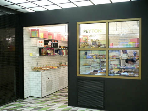
 [Image: Peyton and Byrne by Fashion Architecture Taste].
While buying a fig roll today at Peyton and Byrne – a little cake shop tucked away inside the shared lobby of Heal's and Habitat on Tottenham Court Road – I remembered that the space I was standing in had been designed by Fashion Architecture Taste.
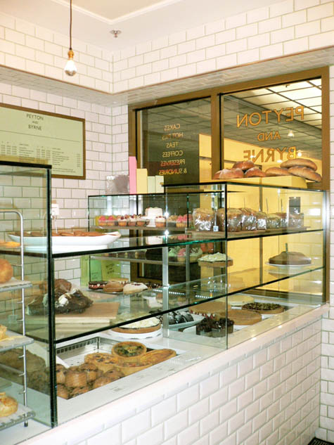
 [Image: Peyton and Byrne by F.A.T.].
The design of the shop "aims to bring to mind an archetypal cake shop," the architects write. They add, however, that "the floor is an Op Art version of a traditional Victorian mosaic floor," updating the archetype, so to speak, by way of the optical strategies of Josef Albers.
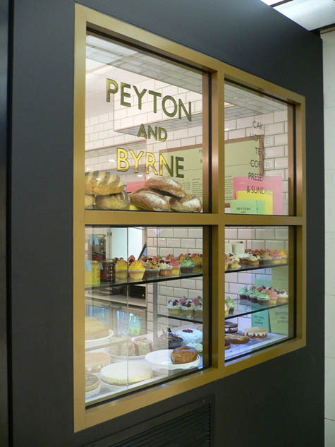
In a way, the shop is as much an act of spatialized graphic design as it is an example of interior architecture; indeed, we read, "Display shelving and units are kept simple and elegant to allow the packaging and food to become part of the decoration." Plates full of cupcakes, jammy dodgers, and gingerbread men thus become edible ornaments – colorful geometries of cookies and tarts that temporarily augment the visual impact of the space before disappearing into customers' unlabeled white paper bags – perhaps even implying a new, highly sugared return of Art Nouveau (wed with generous helpings of Gill Sans). The shop is almost literally a white cube: a gallery of dessert.
Like something out of Willy Wonka – or the more hallucinatory scenes of Young Sherlock Holmes – you go to visit Notre Dame in Paris one morning, only to see that the building's stained-glass windows are actually little flavored wafers and glacé fruits that you can break off and eat... before they're replaced the next day with colorful trays of macaroons.
Thus does architectural ornament find common ground with boutique baking.
 [Image: Peyton and Byrne by F.A.T.].
F.A.T.'s other architecture projects can be explored on their website – and, of course, principals Sam Jacob and Charles Holland also blog at Strangeharvest and Fantastic Journal, respectively.
And the fig roll was good!
(Apologies for the self-reference here, but there is also an interview with Sam Jacob in The BLDGBLOG Book, discussing "spatial debauchery" and the literary work of Joris-Karl Huysmans).


Comments are moderated.
If it's not spam, it will appear here shortly!
Why is it that Gill Sans has been so completely monopolised by the English? Post. Tube. Tattoo parlours. Etc.
Unrelated, I vaguely feel like we are invisibly shadowing each other. I was on Tottenham Ct. Rd. this afternoon, but my home is near Kiama (about 30km from your Mittagong mushrooms).
fig roll, interesting choice...
I love this place! Great to pop in and get a filthymagnificent fairy cake, then pop upstairs in Heals to kick back in the Eames lounger. Heaven.
Their scotch eggs are particularly superb.
@Jack Self
According to Wikipedia Gill Sans is based on Johnston, the typeface designed for the London transport system. The creator of Gill Sans worked on Johnston.
Post a Comment