Art Trap
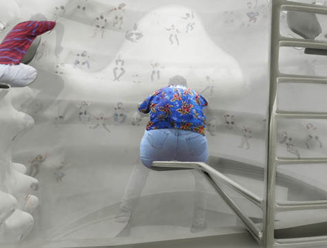 [Image: From Art Trap by Minsuk Cho].
In an amazing response to the Guggenheim Museum's Contemplating the Void call-for-ideas (mentioned in the previous post), architect Minsuk Cho has proposed Art Trap.
Explaining their approach, the architects write that "the Guggenheim has become, in a sense, a victim of its own success due to an over-saturation of human movement in a singular space. Our proposal aims to accomplish the seemingly incompatible: to restore a museum environment conducive to experiencing art and to maximize and heighten other experiences brought about by the iconic status of the museum itself."
The specific strategy here is "to trap, i.e., to force a pause. This programmatic component was not considered by Wright, who envisioned a space defined by tireless motion."
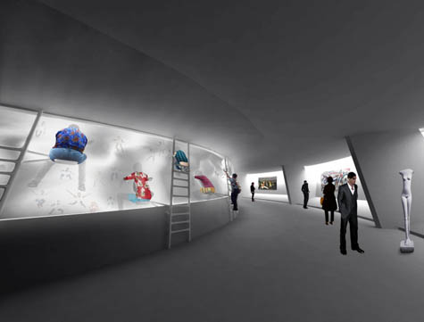
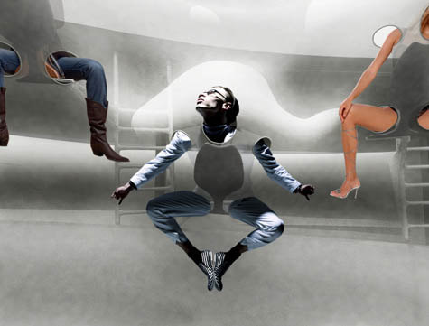 [Images: From Art Trap by Minsuk Cho].
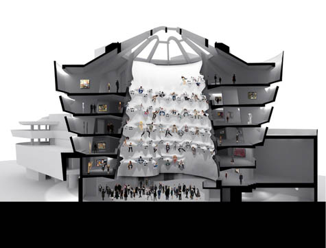
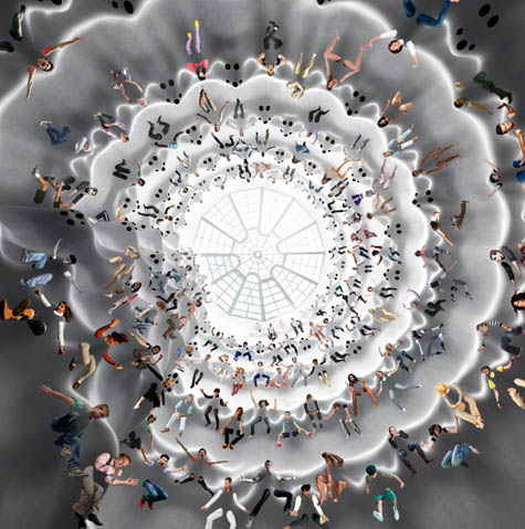
The resulting project is a gigantic membrane stretched throughout the interior, supplying "180 saddle-like seats along the entire ramp for pausing and viewing the rotunda."
- These seats protrude into the void with access ladders arranged in between the floor and the ceiling over the guardrails. Each of the 90 access ladders holds two cantilevering seats, which are angled gradually as they ascend to allow a view of the central area at ground level that functions almost like a stage—as though the rotunda were a new hybrid of opera house and arena. The 180 protrusions over the void are draped with a single, soft and translucent membrane that functions as a safety net.
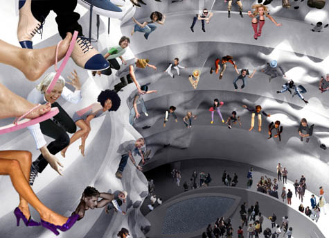 [Image: From Art Trap by Minsuk Cho].
The architects continue, writing that "the pop-out pods, each approximately 60 cm deep, contain seats," and "each pod has five openings for the head and limbs, which make the membrane"—and I love this metaphor—"much like a garment that can be worn collectively by 180 people."
Imagining a piece of clothing so huge you mistake for a building is an awesome change in both scale and context; you would go inside by putting the building on, slipping in one arm at a time.
Of course, this also raises the possibility of tailoring clothing specifically to function only within certain very specific architectural structures: nylon tights that only make sense to wear when seated in one of Cho's "pop-out pods," or sweaters that allow you to experience the spatial extravagance of luxury elevators at a new W Hotel in London. You and some friends zip yourselves up into the wall, forming a new private room that would otherwise not be there.
 [Images: From Art Trap by Minsuk Cho].
But Cho saves the best analogy for last: once the overflowing crowds of art-drunk tourists come to fill the "pop-out pods," it "as if they were performing as a part of a living Baroque ceiling sculpture."
 [Image: From Art Trap by Minsuk Cho].
I had the pleasure of seeing Cho present this project in person at a lecture he gave back in October at Columbia University; this was the project with which he kicked-off the evening, and it set a fantastically giddy tone for the rest of Mass Studies' work.
You can see this and other projects at the forthcoming Contemplating the Void exhibition at the Guggenheim Museum, opening February 12, 2010.



Comments are moderated.
If it's not spam, it will appear here shortly!
Why do I really really dig this idea. I think it is fun and interactive.
what about hygiene though..hhmm I am sure there is a simple solution for this.
wonderful idea in so many ways, but the entire idea of the Guggenheim calling for a way to fill the void in its own building disturbs me somehow. As if a glance inward is the only one they can provide or accept. Cho's irreverence I think is also picking up on the hubris of the proposal.
Do you reckon this will bring a sense of 'going to experience something' rather than simply consuming the museum-going experience?
I'm very cautious about having strong opinions about 'high culture', so it's difficult to know what to think.
trustyourtechnolust.blogspot.com
@Lissy, I disagree. I wouldnt look at it so much as "filling" the void..as if a void in and of itself were a waste, but more of a way to activated a very expensive (from a real estate perspective) hole. this is not disrespectful to mr. wright, but brings new life to this space using technology and social concepts/norms not contemporary to him.
if anything, I'd be worried someone might get sick and puke on patrons below
@tech, good question...wouldnt the art have to play some role in this? or is it irrelevant? I guess this would make Lissy's claims more valid.
the illustratives made me giggle.
re: safety and sanitation, i could easily forsee those cute pink flip-flops falling and bonking someone on their head.
i, in the museum's defense, would dismiss it as an artistic effect!
it's all a matter of perspective, isnt it?
;)
RE: Harpreet: Very simple solution (of water and bleach)
As a coincidental aside:
Meredith Monk broke some ground in and with the space already and wasn't mentioned in the Guggenheim's writeup.
I'm reading William Duckworth's 'Talking Music' and just got to Monk talking of the first installment of her 1969 piece, Juice, which was set in the rotunda. From the interview: "The audience was sitting down at the bottom of the museum on the floor, while the piece took place on the ramps, with a 360-degree field of vision. And, in a sense, it also used the building as the matieral, because I was thinking a lot about architecture in those days."
Early in 2009, ArtForum wrote about a newer piece of hers that echos Juice, among others in its architectural form. It was also presented at the Guggenheim in the same year.
Fun and interactive.
Curious about falling shoes; this could be a problem for those looking up, and it wouldn't be as cool to see bare feet or holey socks... Still it would make a statement.
Dear Geoff:
Sorry, I couldn't find an e-mail address to send this to you but I wanted to drop you a note and say I nominated you for a Kreativ Blogger award. I always find reading your blog interesting and I admire your use of images and text, and your list of links is really comprehensive.
The award is posted on my blog http://www.dalyconservation.com/?p=136
You may have already received this award, the purpose is to list 4 or 7 facts about yourself and 4 or 7 bloggers you admire.
Thanks again for writing such an excellent blog.
Rose Daly
Hey Rose, thanks! That's awesome. I appreciate the vote of confidence. A nice way to start the new year.
what about the consideration for less abled people, and why is everyone in the image young and trendy? You'd get people spitting i bet too. But practicalities aside i quite like it, reflective interiors would be good too so that the individual can construct the wall as much as the numbers of people
Post a Comment