Digital Analog
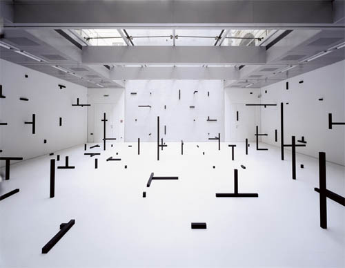 [Image: O.T. (2006) by Esther Stocker, photographed by Rainer Iglar].
Here are two projects by artist Esther Stocker. They both use the black, abstract outlines of fragmented spaces to suggest much larger architectural shapes. There is the implication in each that, if only you could stand in the right place, at the right angle, all of these detached typographies of edges and corners might merge, Felice Varini-like, overlapping backward through the stages of a slow explosion, to form a building.
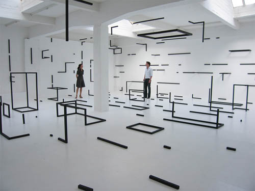 [Image: Abstract thought is a warm puppy (2008) by Esther Stocker; photo by Sacha Georg].
But each of these also has the optical side-effect of generating what looks like an immersive matrix of information hovering somewhere in the room in front of you, the stark contrast between black and white, and the geometric clarity of the pieces, taking on a disconcertingly digital air.
Tangentially, I'm reminded of the System Wien/"Architecture of Energy" project by Lebbeus Woods and Christoph Kumpusch, which translates a series of seemingly directionless sketches of white lines in black space—
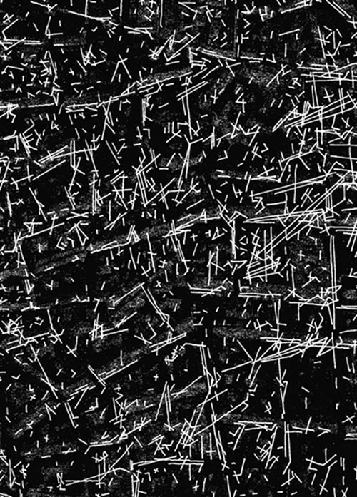 [Image: From System Wien/"Architecture of Energy" by Lebbeus Woods and Christoph Kumpusch].
—into reflective implications of perimeters, the outermost envelopes of buildings that don't exist, when "drawn" onto city streets with metal pipes.
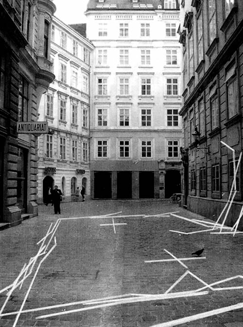
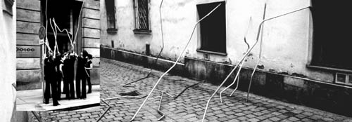 [Images: System Wien by Lebbeus Woods and Christoph Kumpusch installed on the streets of its urban namesake].
This up-scaled materialization of the 2D sketch—from flat line on paper to angular filling of space, built with what Woods calls "vector rods"—for me also has the optical effect of gesturing toward something that doesn't really seem to be there. In other words, these pipes, so reflective as to appear white, seem more like retinal tears (or even scratches in the negative), not objects that you can actually see or touch somewhere out there in the city. They are pieces of an invisible building—like fingernail clippings of space.
(Esther Stocker spotted via but does it float).



Comments are moderated.
If it's not spam, it will appear here shortly!
Nice. It also recalls Buky Schwartz's work, esp. his "videoconstructions."
http://bukyschwartz.com/
Absolutely beautiful cross between art and perception!
If only we could design outdoor public art in similar ways. Would make for a very interesting experience of the public realm.
and mondrian's pier and ocean
Awesome concept. Wonder if it could be made functional?
the first one is incredible. This indoor installation looks amazing. Kind a slim 3d tetris…
Thumbs up!
This is something I am also trying to explore through my thesis. How the virtual meets the physical.
https://vimeo.com/52946720
A small test I did, to draw a space we usually don't get to see.
Do you have any other references on these types of questions?
Post a Comment