Blue Tape
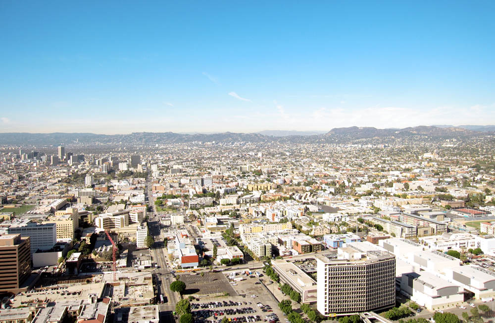 [Image: Los Angeles seen from the 51st floor of City National Plaza, 13 December 2010].
 This past week brought the autumn term to an end here in Los Angeles. For two days, students from the USC School of Architecture participated in an experimental final review called "Blue Tape," named after the blue painters' tape that the students were required to use in mounting their boards. The technique didn't quite stick with all projects, however, as students were given often very confined spaces—their boards thus overlapping—or irregular surfaces on which they were meant to display.
"Blue Tape" took place in the otherwise empty interior of a former corporate law office on the 50th and 51st floors of City National Plaza, in downtown Los Angeles. It was an open review, meaning that friends, family, critics, faculty, staff, administrators, fellow students, confidants, significant others, complete strangers, visitors, and the odd building-maintenance crew could wander around, from room to room and corridor to corridor, for hours at at time and check out student work. A reception, overlooking the nighttime intersecting grids and bulging topographies of the city outside, capped it all off.
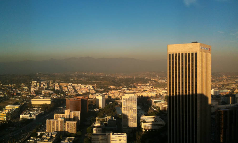 [Images: Downtown Los Angeles at sunset on 13 December 2010].
 Archinect's Orhan Ayyüce, who participated as a kind of roving juror at "Blue Tape," including for my own students, writes that, amidst all the reviews he'd done in the past two weeks, "this was the most special one in terms of providing a populated spectacle and a picture of a large beehive-like platform of youthful power."
The novelty of the arrangement certainly contributed to this sensation. For two evenings in December, the post-recessional emptiness of a downtown corporate office space, with its 1970s wall decorations, flickering fluorescent bulbs, and worn carpets, framed an almost explicitly theatrical staging of architectural wish-fulfilment: a new generation could freely project its own ideas for future cities and building types, under the panoramic spell of a delirious implication, that these cavernous board rooms and floor-to-ceiling glass windows offering views from mountain to sea and back again, might someday house their own design practices. As Orhan phrased it, with what I sense is slight irony, "USC: the world is yours." However misleading this setting thus might actually have been, it was an enticing carrot to chase.
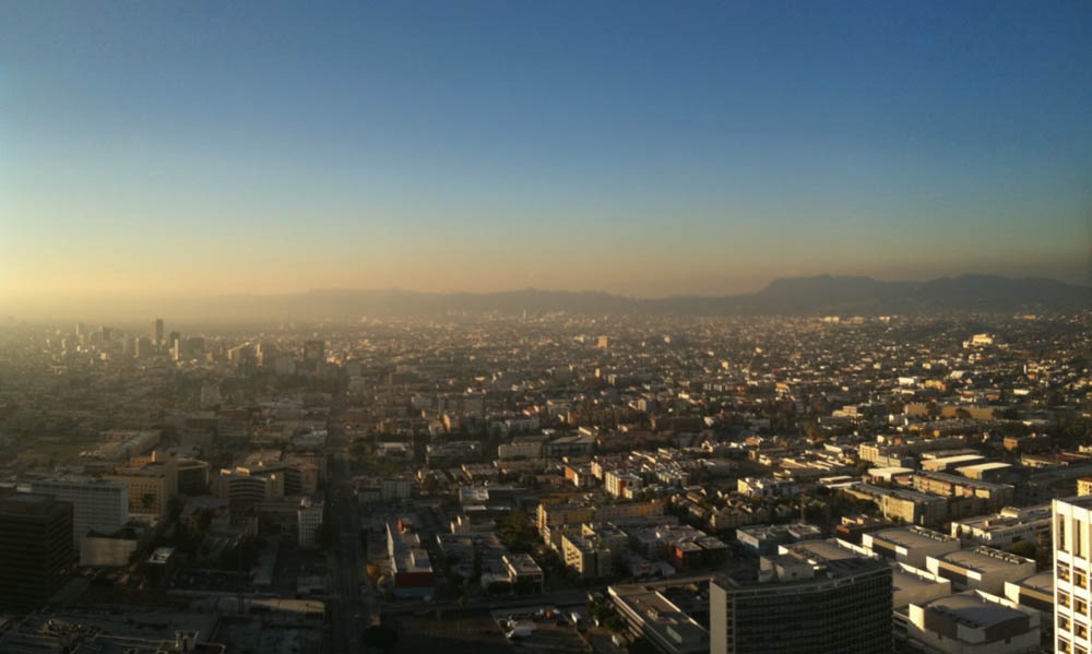 [Image: Los Angeles at sunset from the 51st floor of City National Plaza on Monday, 13 December 2010].
 On the other hand, should something like "Blue Tape" become a regular institution for USC, I can see the format—and the location—losing much of its imaginative power after only a few repetitions. Further, it wasn't all carrot: there were many sticks. Requiring students to transport often massive and easily damaged display boards on the Los Angeles bus network or, alternatively, to pay, without the possibility of reimbursement, truly exorbitant parking fees to attend their own final reviews, and to push such a time-intensive experience so far off USC's main campus during the same week as final exams, thus compelling many students to leave "Blue Tape" in the middle of everyone else's presentations, missing out on the intended camaraderie of the day in order to rush back to campus alone and turn in their final papers, is also surely something you can demand only a limited number of times.
As such, faced both with these limits and these opportunities, the students did a fantastic job, their patience and perseverance perhaps exceeding the organizational foresight of the faculty. The beehive of youthful power that Orhan diagnosed is alive and well.
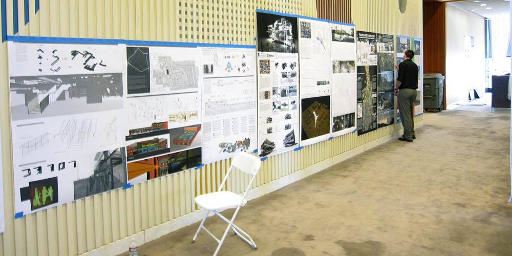 [Image: "Cinema City" projects at the USC School of Architecture's "Blue Tape" review].
 Below, I've included some photos taken of my own students presenting their work for a class I called "Cinema City." As I wrote in the previous post, that studio asked students to consider the architectural future of the movie-going experience. In other words, if today's increasingly fragmented audiences are just as likely to watch films on their iPhones or tablet computers—not to mention through all-you-can-watch DVD subscription services on home TVs—as they are at the local shopping mall, then what architectural effects might these emerging consumer practices and distribution technologies soon have?
If cinemas, for instance, like libraries, face an uncertain social and economic future, what lies beyond the multiplex and the iPad, on the other side of IMAX and at-home on-demand? If the building type now known as the cinema is forced to mutate, what might it become and how could architects today preemptively steer its future design? What spaces or scenarios can architects imagine that might transform—and re-inspire public interest in—going out to watch movies in public? Further, how might these new spaces influence and interact with the design of the city itself—and possibly even how films are produced?
We read everything from histories of Baroque city planning and theatrical stage-set design, via books like The City of Collective Memory and Margaret Wertheim's "history of space from Dante to the internet," and we looked at photo essays of ruined cinemas as well as architectural histories of American movie theater design. Perhaps the most exciting part of the class, however, was simply watching the daily news for examples—taken from the immediate present—of cinematic experiences that radically rethink the traditional movie theater: new screen and projection technologies, new distribution plans hypothesized for Netflix, new types of movie-centric social gatherings in cities and rural villages around the world.

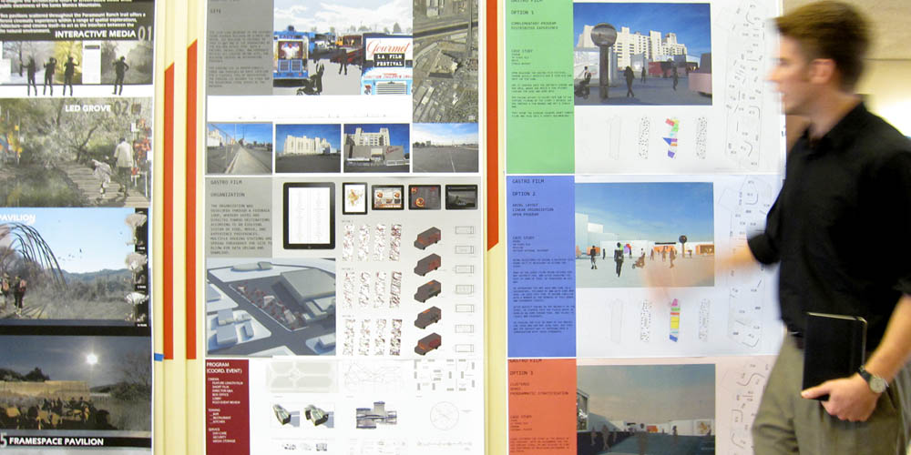
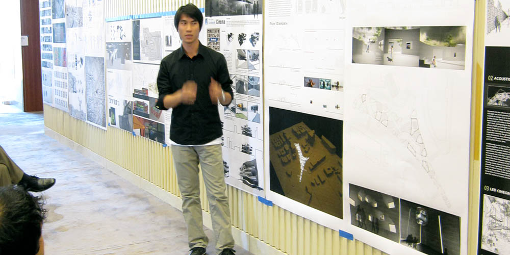
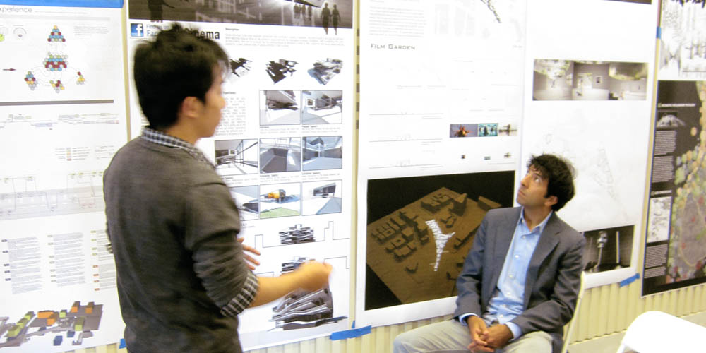
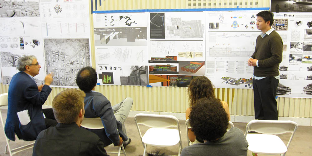
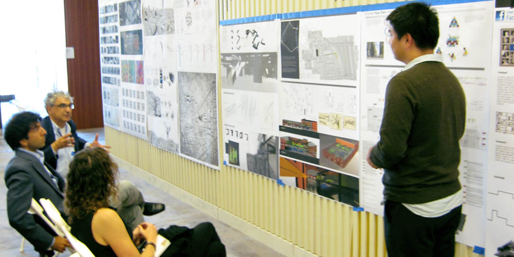

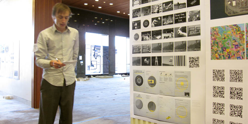
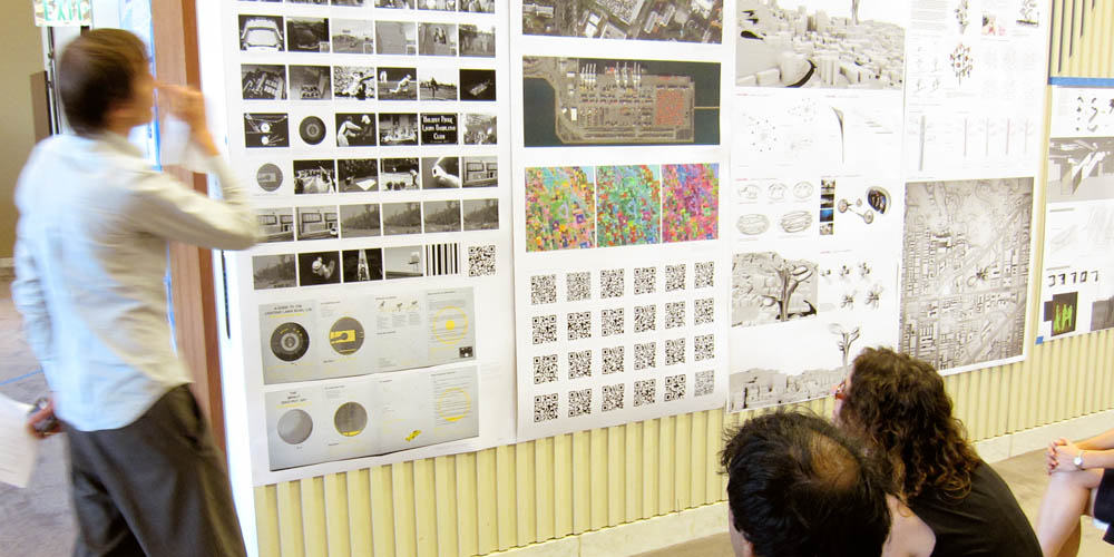
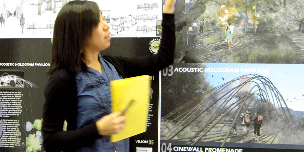
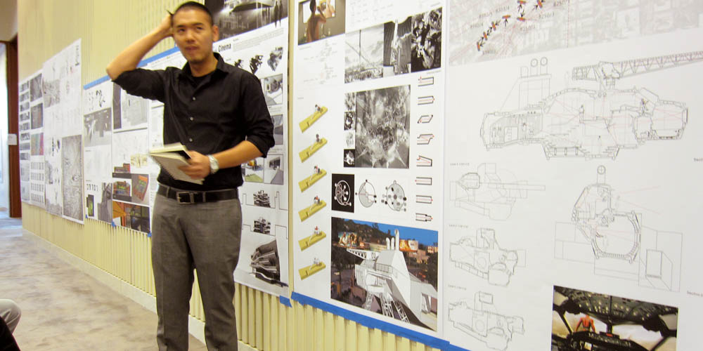 [Images: Students enrolled in "Cinema City" at the USC School of Architecture present their work].
 Amongst much other work produced over the course of the semester, the resulting projects specifically presented at "Blue Tape" ran the gamut from repurposed lifeguard stations on the beaches of Santa Monica, transformed into luxury film-cabin rentals and outdoor screening rooms (by student Arthur Page); a series of "film pavilions" for the Santa Monica Mountains, featuring strikingly imaginative uses of hologram-projection technologies and subterranean sound-amplifiers to create truly novel spaces for contextually appropriate films (Jennifer Choi); a cinema designed as if Facebook were the client, with interactive media walls, open terraces for people-watching, and intensely social, rearrangeable interiors, asking the awesomely provocative question of how the various functions of Facebook—from commenting to liking to friending—could be architecturally spatialized in a future multiplex (Anran He); a "film garden" of irregularly angled walls, open courtyards, and enclosed spaces situated on a conjoined archipelago of traffic islands near Beverly Center (Heli Zhang); an outdoor food & film festival imagined for Gourmet.com, with moving screens and survey-determined parking spots for food & projection trucks (Judson Hornfeck); a "cloud tower" of monumental, orchid-like film-viewing pods looming over the streets of Hollywood from a centralized, elevator-filled stalk (Jiejun Li); a "Choose-Your-Own-Adventure" cinema installed inside a multilevel constellation of renovated cargo containers in an old warehouse near the L.A. River (Mike Chou); a private house on Sunset Boulevard built for a reclusive film fanatic—the building would be an "otakutopia," as the project was called—filled with innumerable wall-mounted optical devices, including wearable periscopes and a kind of lens-cannon on the roof, allowing the eccentric homeowner never to be far from his beloved screen-based media, his house an inhabitable telescope (Yu-Quan Chen); and the QR cinema of the robot future, with films made by machines for machines, as described in the previous post (Jonathan Rennie).
Our guest critics that day were also hugely helpful: Christian Chaudhari, Julian Bleecker, Lisa Little, Darien Williams, and Orhan Ayyüce all contributed to what I thought was a great five-hour conversation about cinema's still undetermined architectural future.
Finally, you can see slightly larger versions of the above photographs in this Flickr set.



Comments are moderated.
If it's not spam, it will appear here shortly!
Wow. Well written article! It was great to hear about the specifics of the class requirements and thought process as a student who merely observed the final product on the walls. Also, it was refreshing to hear at least one member of the faculty acknowledge the difficulty that the super-review presented to students. I agree completely with the points you made. Please stand up for us as we voice our opinions to the departments as a whole!
What happened to making architecture models of your project!? Don't students do those anymore? I did, when I was at USC...long long ago...in the year 2000.
All I see is a bunch of Rhino driven, photoshop enhanced images of architecture that is so unreal, you can't even make a model of it.
I'm sure the projects are great, but I think making a model is an invaluable tool that only makes your work better. Maybe they did make models? Who knows. Where are they?
Interesting narrative on reviews. I agree with the lack of model comment though. I see it at the m.arch program I'm at too: a de-emphasis on model-making and strong emphasis on computer-driven design which ends up looking pretty generic because of the handful of programs/tools we're limited to.
cool studio brief through!
I am a USC student, first year Masters of Architecture, and as far as I know every Masters of Architecture student had a model. The models are just not showing in these photos. Usually the model was sitting on the floor or being passed around among the reviewers. I personally had 5 study models and a final model which I worked very hard on and was proud of. My studio professor, Andrew Atwood, had very high standards in terms of our models and I think our studio delivered. I saw some of the best models I have ever seen at this event.
Post a Comment