Mash House
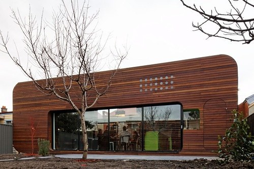 [Image: Mash House by Andrew Maynard Architects; photo by Kevin Hui].
The Mash House by Andrew Maynard Architects has taken shape on its site in Australia, and, minus a forthcoming regrowth of the immediate landscape, it looks great.

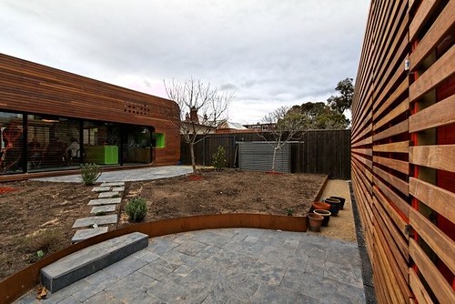 [Images: Mash House by Andrew Maynard Architects; photos by Kevin Hui].
It's more like a wooden object extruded from an industrial design seminar than what you might expect from a suburban home, and it's also gloriously retro-colorful on the inside, with a lime green kitchen and pixellated red tiles in the bathroom.
Here are some photos.
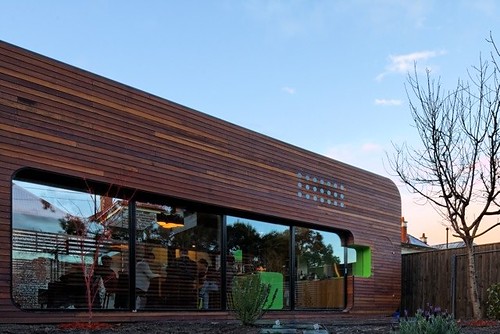
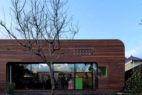
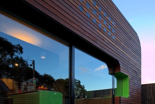 [Images: Mash House by Andrew Maynard Architects; photos by Kevin Hui].
The interior, as I mentioned, is a very Dwell-friendly throwback, complete with seamless expanses of color, rounded edges, sliding glass walls, and retro furnishings (brought in by the homeowners).
Very little project text is available online at the moment, however, so I'm basically just describing these photographs; I'm sure you can see for yourself how the interior has been styled.
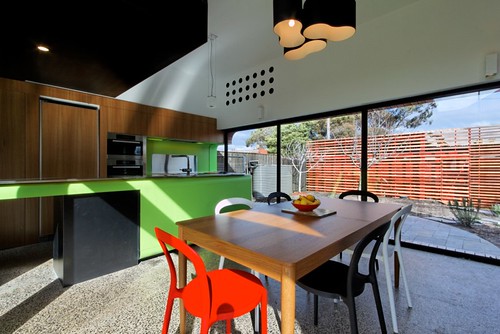
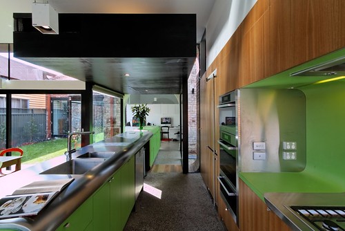
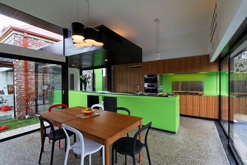
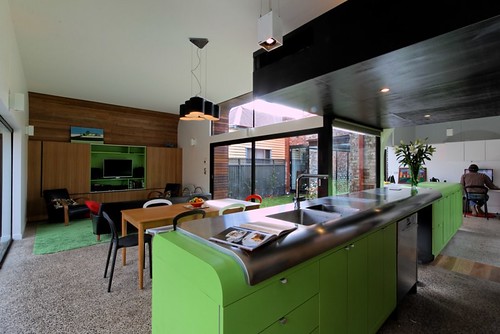
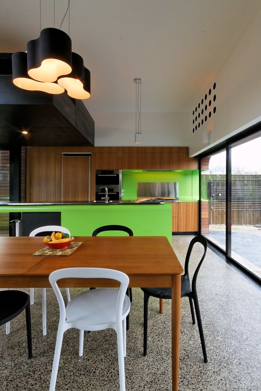

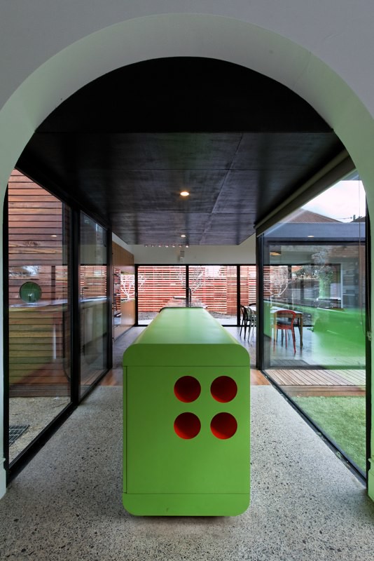 [Images: Mash House by Andrew Maynard Architects; photos by Kevin Hui].
And here are two shots of the bathroom, red tiles included.
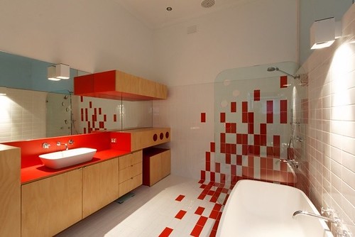
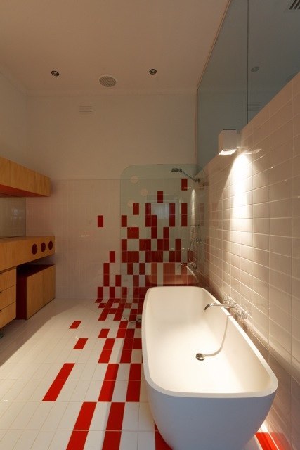 [Images: Mash House by Andrew Maynard Architects; photos by Kevin Hui].
Finally, these process-shots taken during construction show the house in a bit more of its context—which makes it look even more interesting as an experiment in suburban form.

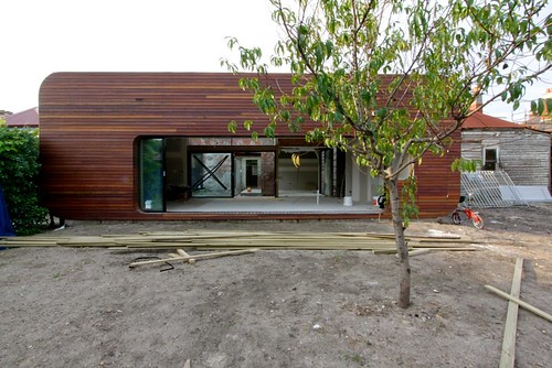
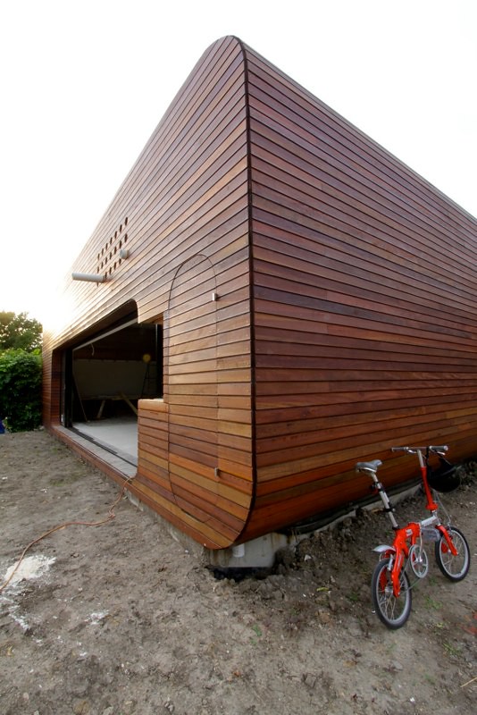 [Images: Mash House by Andrew Maynard Architects; photos by Kevin Hui].
I'd personally love to see more bookshelves—à la the Casa Kike or the interior of The Brain—but that's probably only due to my own megaton collection of outdated paper-based texts...
See more at Andrew Maynard Architects.



Comments are moderated.
If it's not spam, it will appear here shortly!
Nice house indeed... I like the shape of hole building...
Photos are by the wonderful Kevin Hui [aka @swank_e].
Thanks for posting Geoff!
Initially, I thought this was a crossover with the "Unhappy Hipsters" blog.
Thanks, Andrew – I added Kevin's credit to the post.
Great house!
I like the peek-a-boo effect of the exterior lime green window sill.
Why does this remind me of Jacques Tati's Mon Oncle?
I keep looking for the gasoline pumps out front....
Dreams of Stanley Tigerman....
Post a Comment