|
|
 [Image: Bel-Air by Mathieu Lehanneur]. [Image: Bel-Air by Mathieu Lehanneur].These air filters, by Mathieu Lehanneur, seem so hilariously inefficient and bizarre to me, but hey – I love the idea. They turn plants into air filtration machines – miniature ecosystems put to work. Somewhere between a terrarium and biotechnology. The designer himself describes the filter as "a vegetal brain enclosed in an aluminium and Pyrex cranial box." That "brain" then cleans the air in your house for you.  [Image: Bel-Air by Mathieu Lehanneur]. [Image: Bel-Air by Mathieu Lehanneur].More specifically, Lehanneur's Bel-Air system "is a mini mobile greenhouse" that "continuously inhales" air into an enclosed system of "three natural filters (the plant leaves, its roots, and a humid bath)." The air is then released again, "purified." This patented principal has two advantages: Bel-Air is to the American and Asiatic common filter appliances what Dyson is to regular vacuum cleaners. Here, the noxious particles are captured, and transformed inside the system. No more filters to change, and no more clogs. Lehanneur was at least partially inspired by NASA's old research into space gardens, wherein living plants were to be installed on spaceships in order to filter, clean, and continually recirculate the exhaled breath of astronauts. As such, this project reminds me of the oxygen garden from Danny Boyle's film Sunshine. 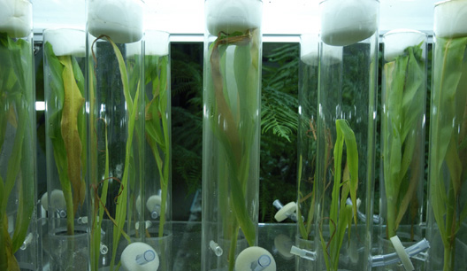  [Images: The Oxygen Garden from Sunshine, courtesy of DNA Films]. [Images: The Oxygen Garden from Sunshine, courtesy of DNA Films].There we see a whole room – full of plants, circular fans, UV lights, and timed irrigation tanks (the Earth in miniature, technologically replaced) – built aboard the film's main spacecraft, forming "a natural, unmechanical way of replenishing [the ship's] oxygen supplies." All houses should be greenhouses. Imagine going to work in a place like that – in an oxygen garden – bringing the tropics to an exurban office park near you. Creeper vines, and Pyrex-shelled ferns, and huge corridors lined with orange trees – groves and orchards spiraling above you up stairways and halls. The sheer terrestrial weirdness of flowering species. What is it about plantlife that seems so inherently sci-fi? (For the Bel-Air's complete press release, see Dezeen).
Will an astronomical machine buried in the ice of Antarctica someday reveal what the Earth's core really looks like? 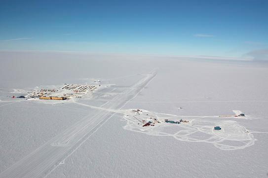 [Image: The IceCube's surface workings, Antarctica; via New Scientist]. [Image: The IceCube's surface workings, Antarctica; via New Scientist].Last week, New Scientist reported that a neutrino detector called IceCube, once constructed, might just do exactly that. Because the Earth rotates, we read, distant neutrino sources – such as black holes – will be blocked at certain predictable moments by the Earth's core; piecing together all these temporary blindspots, we can then infer the shape of the core itself. It's an absence that generates absences elsewhere.  [Image: A schematic diagram of the IceCube]. [Image: A schematic diagram of the IceCube].The "machine" itself, meanwhile, is actually quite extraordinary: incredibly, it will "fill a cubic kilometre of ice" – and yet it's really a buried network of connected glass balls. According to The Daily Galaxy, building the IceCube is less an act of construction than a kind of archaeology in reverse; the process will consist of entombing "glass-globed sensors the size of basketballs on 1-mile-long strings, 60 sensors per string, in 80 deep holes beneath the polar surface." This will then allow scientists to develop, that same writer says, a "library of the universe" – something that would make even Borges proud. So I'm left thinking of at least two things: 1) In John Carpenter's 1983 remake of The Thing, a team of Norwegian researchers finds something buried in the ice of Antarctica; it turns out to be a spaceship... which, according to a later group of American scientists, must have been there for more than 100,000 years.
It's frozen solid, and older than writing.
But what if, down there in the ice someday, we find something not unlike the IceCube – only we didn't put it there, some vast and buried machine with no identifiable purpose, origin, or design?
Or perhaps next year some lone helicopter pilot will go flying around, scanning the ice with radar, only to discover that what appears to be a geological formation is actually a machine, some ancient, hulking technology indistinguishable from bedrock... Or a machine made entirely from ice, still detecting the remnants of galaxies.
Perhaps even telescopes dream. 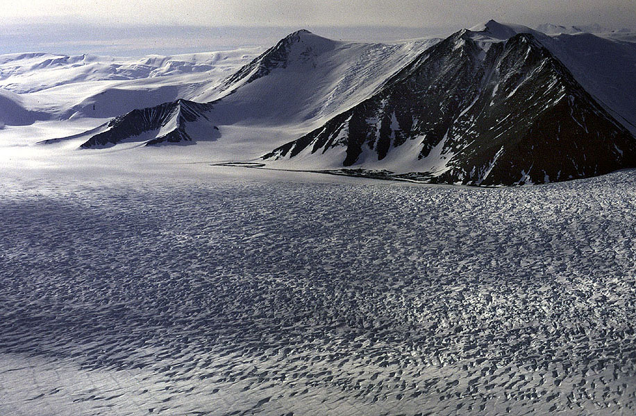 [Image: A glimpse of the Transantarctic Range]. [Image: A glimpse of the Transantarctic Range].2) I was joking with a friend the other day that Americans are always stumbling upon the face of Christ in unexpected places, and then ending up on CNN. They find Christ on a pancake, or on a piece of burned toast, or on an Eggo waffle (these sightings often involve breakfast foods), or even in the bark of a tree – and the people who discover these faces never once seem to think that what they're suggesting is sacreligious: God has sent unto you his only son... disguised as a croissant.
But what if, after all the numbers are crunched and the maps are made, we find that the core of the Earth looks like the face of Jesus? What then? Nevadan entrepreneurs will suggest that we rescue it, digging it up with diamond drills, polishing it and storing it in a church somewhere.
Imagine the core of the planet on display behind stained glass inside a cathedral near Paris, or down in an old consecrated basement in central Rome. Under armed guard. Why is there not more holy geology?
Someone breaks in, using C4, a pair of infrared goggles, and a lot of rope, and they try to steal the center of the planet... For more on the IceCube and Antarctic science in general give this article in The Economist a quick read – then check out NOVA's round-up of weird detectors. Then, if you're looking for a good book on Antarctica itself, consider picking up a copy of Terra Antarctica: Looking into the Emptiest Continent by William L. Fox (a book previously mentioned on BLDGBLOG here).
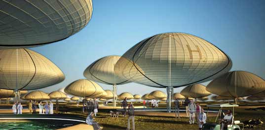 [Image: Algae balloon communities in Iceland by the Philadelphia-based 202 Collaborative]. [Image: Algae balloon communities in Iceland by the Philadelphia-based 202 Collaborative].A few years ago I audited a course about Archigram at the University of Pennsylvania, just something to do on a Wednesday morning before I went to work – but one of the things that indirectly came out of that experience was BLDGBLOG. It's interesting to note, then, that one of the other people in that class now writes Brand Avenue; another's work was featured here on BLDGBLOG last year; and, this morning, another course attendee emailed to point out a proposal that he's helped assemble and conceptualize, about hydrogen-powered urban design in Iceland. 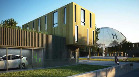 [Image: Algae balloons and the houses they serve, by the 202 Collaborative]. [Image: Algae balloons and the houses they serve, by the 202 Collaborative].That project, originally intended for a design competition, imagines carefully engineered algae ponds and balloons of hydrogen gas fueling the Icelandic city of the future. It's Icelandic New Energy (INE). 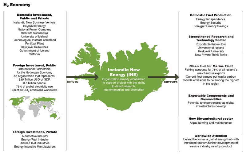 [Image: An Icelandic hydrogen economy, outlined by the 202 Collaborative; view larger]. [Image: An Icelandic hydrogen economy, outlined by the 202 Collaborative; view larger].As the designers note: It has long been known that algae produce small amounts of hydrogen as a byproduct of photosynthesis. In 1999, researchers in Berkeley observed that algae alternate between hydrogen production and normal photosynthesis depending on the chemical environment. Depriving algae of oxygen and sulfur, the researchers greatly increased the hydrogen production and triggered the algae to produce hydrogen for an extended period of time. Another research group also discovered that algae will sustain simultaneous production of hydrogen and oxygen from water by illuminating the algae and depriving it of carbon dioxide and oxygen. Researchers estimate that a small pond (1.5 acre or 10 meter diameter) will produce enough hydrogen on a weekly basis to fuel 12 cars. Of course, a part of me wonders if this whole thing would be easier to solve if we just got rid of those 12 cars – but I understand that that wasn't the point of this design exercise.  [Image: 202 Collaborative]. [Image: 202 Collaborative].However, referring to things beyond the scope of this project, a part of me does find it a bit depressing that we'll go to all these lengths – we'll totally redesign the industrial base of society – only to jump back into our Escalades and drive out to buy organic cotton Christmas mittens at the local Baby Gap. It seems like an awfully long distance to go to get nowhere, in other words. After all of this, we'll do the exact same things, outshopping one another on greengoods.com and parking our solar-powered sustainable sports cars somewhere in that sprawling tangle of garages and freeways that we never disassembled out back. Everything will be recycled, yet everything will be the same. We'll watch internet sitcoms and judge each other's social value by the hemp dresses that our girlfriends wear. In any case, that's a pet peeve of mine that deals with things well outside of the project featured here. 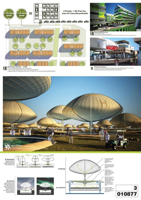 [Image: A broader view of the plan by the 202 Collaborative; view much larger]. [Image: A broader view of the plan by the 202 Collaborative; view much larger].These renderings are gorgeous, meanwhile, and they lead me to wonder what Archigram would be doing today, if they had grown up designing in a world powered by alternative fuels. What strange new worlds of hydrogen balloons and algae ponds extending off past the urban horizon might we then see? Crops harvested from the roofs of brick tenements in north Philly. Steel frameworks of solar concentration arrays visible in the cracks between buildings as we step over bio-boulevards and water filtration systems on our way to work. Vast harddrives made entirely from milled crystal move glass elevators floor by floor through the environment ministry, carrying cloned medicinal plant samples up to their examination chambers... All narratives of the future are fair game when you're talking about architectural design. Anywho, although their site is still under construction, be sure to stop by the homepage of the 202 Collaborative. (Thanks, Patrick!)
 [Image: Boutique Monaco by Mass Studies; view larger]. [Image: Boutique Monaco by Mass Studies; view larger].I've mentioned architect Minsuk Cho, of Mass Studies, on BLDGBLOG before: he designed the so-called " ring dome" for the Storefront for Art and Architecture's Z-A event last month in New York City, and he collaborated with Jeffrey Inaba's SCI-FI studio to propose an " urban district above the water" in Seoul. I'd say that Mass Studies is hard to beat for sheer spatial interest and originality; witness their Torque House, Pixel House, or Cheongam Media Headquarters, for instance – let alone the famously freaky Seoul Commune 2026. 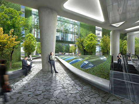 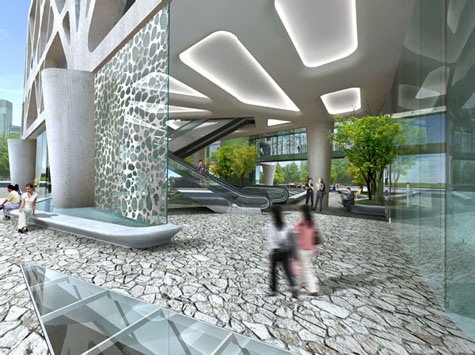 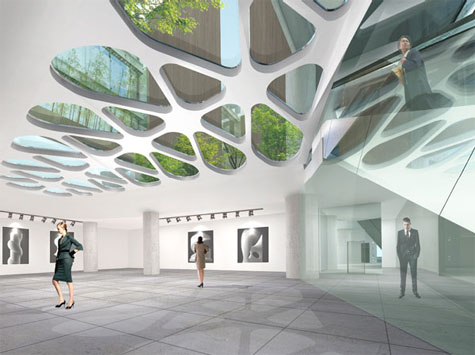 [Images: Three rendered views of the building's lobby and ground level exterior]. [Images: Three rendered views of the building's lobby and ground level exterior].Or take a look at the Boutique Monaco, pictured here. The Monaco is "a high-density, massive building for residential/office/commercial/cultural activities to be located in the heart of the Seoul metropolitan life, the area around Gangnam station."  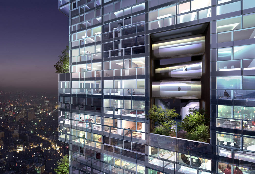 [Images: Day and night renders of the project's exterior, complete with punctuated vertical bays of greenery and residential terracing; view both the top and bottom images larger]. [Images: Day and night renders of the project's exterior, complete with punctuated vertical bays of greenery and residential terracing; view both the top and bottom images larger].As Mass Studies explains: Unlike the existing high-rises where one is segregated from the outside world as soon as he [or she] leaves the ground floor, Boutique Monaco will be a building where at each level will be a vertical open space accessible from different spots in the floor. The exterior, designed in an orthogonal pattern in the interest of efficiency in space allocation, is intended to strike a balanced harmony with the surrounding box-type high-rises. Further: "In the plan for Boutique Monaco, around 172 units are created in 49 different types and sizes and interconnected as if in an enormous puzzle. At the same time, different types of internal/external, private/public areas are to be installed." You can see some of the building's floorplans here.  [Image: A kind of rooftop park and bioscape, complete with what appears to be a helipad]. [Image: A kind of rooftop park and bioscape, complete with what appears to be a helipad].The project can be seen in renderings, drawings, and diagrams on the Mass Studies website – but also now in photographs. The building is under construction even as this post is being written, and it should be open for inhabitation by late summer 2008. 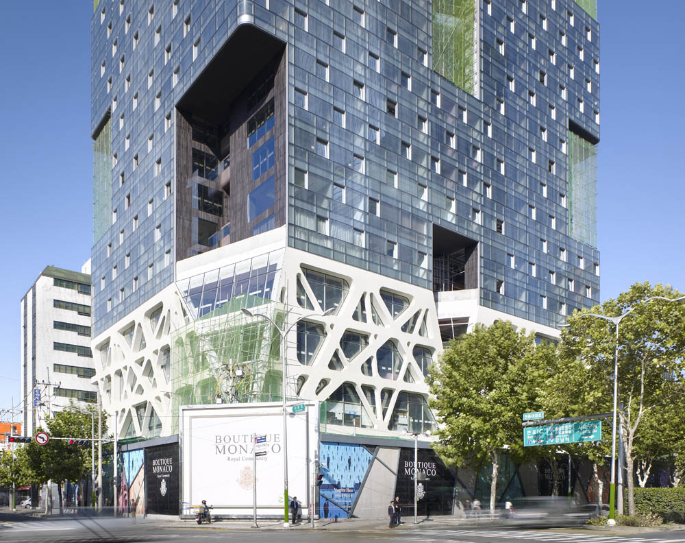 [Image: The Boutique Monaco under construction; view larger]. [Image: The Boutique Monaco under construction; view larger].Meanwhile, I don't mean to uncritically promote the actions of a property developer in Seoul; nor do I wish to suggest that because this building has a few trees growing out of it that it's "green." But I do have to say that I like 1) the project's use of materials (the wood cladding inside the vegetated nooks is especially brilliant), 2) the punctuated bays themselves, which break up the facade in a really great way and add a spatially and experientially inspired dimension to the project, and 3) the diagonal bracing, however ornamental and non-structural it may be, of the podium. We may be seeing more and more of these sorts of structural weavings – but that's because they're cool.  [Image: Bracing at the base of the Boutique Monaco; view larger]. [Image: Bracing at the base of the Boutique Monaco; view larger].For other projects by Mass Studies, check out their archives.
 [Image: This post was originally published last winter in Blend, translated into Dutch]. [Image: This post was originally published last winter in Blend, translated into Dutch].
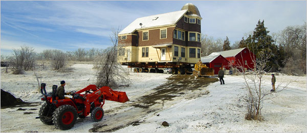
Last winter The New York Times reported on a surprising growth industry in the United States: the physical relocation of old houses.
This is the somewhat surreal activity of transporting entire, intact buildings from one place to another, often over more than one hundred miles.
A single-family home, for instance, will be "jacked up" – like a car with a flat tire – so that "long steel beams" can be inserted between the house and its foundations. Very slowly, the house is then disconnected from the surface of the earth and loaded onto the back of a lorry.
If you think that sounds easy, however, bear in mind that some houses "have to be broken into two or more pieces" during this process and the roofs must often be removed. Removing the roofs streamlines the structures for highway transport, allowing them "to pass under power lines, bridges and trees" as they make their way to a new location. After all, as one whole house relocation client jokes: "The last thing you want is to show up one morning and find they’ve lopped off a room during the night."
 [Image: Photo by Stewart Cairns for The New York Times]. [Image: Photo by Stewart Cairns for The New York Times].
Transporting an intact house along the American interstate highway system can take several days. Worse, it can "cost hundreds of thousands or even millions of dollars." One such relocation job was so complex, the article explains, that it "required the bulldozing of a temporary access road," and that was simply to remove the structure from its original plot of land.
But, even then, the troubles aren’t over.
After a house has been installed on its new foundation, it might need to be re-assembled – and this means "putting the house back together from thousands of pieces" while carefully following page after page of engineering notes, photographs, drawings, and detailed architectural plans so that you don’t put anything back in the wrong place.
 [Image: Photo by James Edward Bates for The New York Times]. [Image: Photo by James Edward Bates for The New York Times].
My first thought when I read this was of all those dinosaur skeletons now standing silently in museums around the world. What if someone, somewhere, got something wrong? What if they used the wrong skull on the wrong spine – or they attached the wrong leg, the wrong jawbone – and so the whole bodily form needs to put together again, perhaps with pieces from other dinosaurs in other museums far away?
Because what if your house gets moved three hundred miles but the bedroom is inadvertently attached to the wrong floor? Or two entire houses get mixed up along the way – what strange new architectural styles might result?
These are more than rhetorical questions.
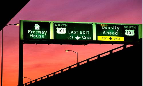
Just last week, for instance, Christopher Hawthorne wrote a short article for the L.A. Times about a single family house that literally crashed onto the side of a freeway in Los Angeles.
 [Image: Photo-illustration by Aaron Goodman for the L.A. Times]. [Image: Photo-illustration by Aaron Goodman for the L.A. Times].
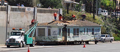
Soon known as the Freeway House, "the single-story structure had been on its way from Santa Monica to Santa Clarita a few weeks ago, riding atop a trailer, when it smashed into an overpass and came to rest on the shoulder of the 101 in the Cahuenga Pass."
It then just sat there.
For 10 days.
 [Image: Photo by John Fuentes, found via the L.A. Times]. [Image: Photo by John Fuentes, found via the L.A. Times].
It was an uncannily accurate, if entirely unintentional, comment on life in today's Los Angeles: a house stranded on the side of a freeway, with no context or human history in sight.
But what, I might ask, would have happened if the Freeway House had not crashed into a bridge but into another tractor trailer, carrying another house, and those two structures had then merged – even if only temporarily, in mid-air, a kind of post-deconstructive act of architecture lasting mere milliseconds in a cloud of debris above the L.A. freeway system – and then a third building, and a fourth...?
Soon architecture schools are teaching their students as much about car crashes as they are about CAD.
In this context, perhaps the crash could be a future strategy for architectural design: load the Taj Mahal, the Vatican, something by Mies, and an entire American suburb onto three dozen lorries, then crash them all together on a remote German autobahn. Photograph the results.
J.G. Ballard would be proud.
In any case, the whole-house relocation industry would have it so much easier if residential structures were built to move in the first place. The internal structure of a building could incorporate wheels, pulleys, gears, and other machine parts, thus allowing the house to be reconfigured, even geographically relocated. A building could simply attach itself to the local railroad tracks and slip away…
You report your house missing – but Interpol soon finds it: its windows have been smashed and it's covered in graffiti, and it's sitting next to a road outside Thessaloniki.
It misses you.
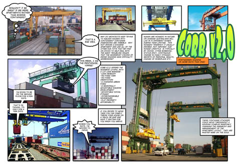 [Image: Corb v2.0 by Andrew Maynard]. [Image: Corb v2.0 by Andrew Maynard].
With these thoughts in mind, then, I got an email from Australian architect Andrew Maynard announcing a new project that he and his office had just finished putting together.
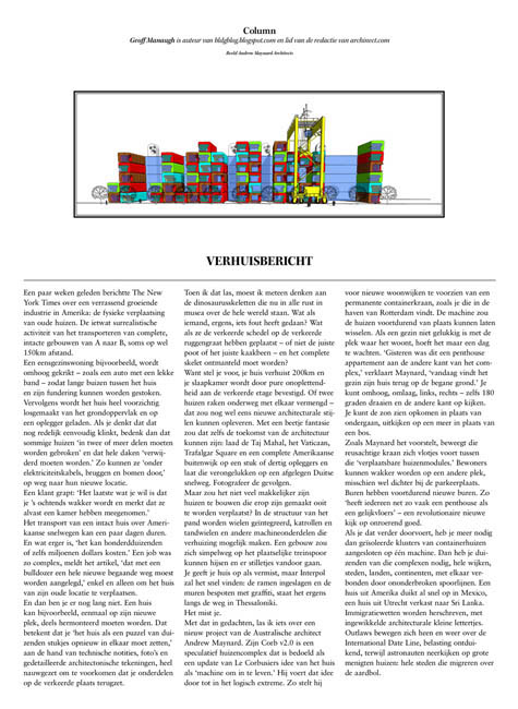
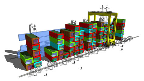
Maynard’s Corb v2.0 is a speculative housing complex that serves to update Le Corbusier’s old idea of the house as “a machine for living in” – and Maynard takes that statement to its logical extreme.
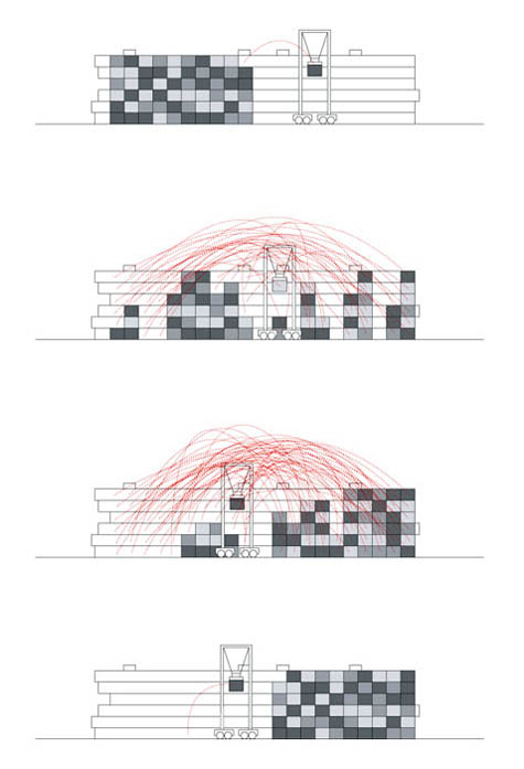
He proposes permanently incorporating a cargo container-stacking machine into a new residential suburb. The machine would thus rearrange all the houses on a near-continual basis.
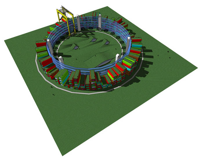 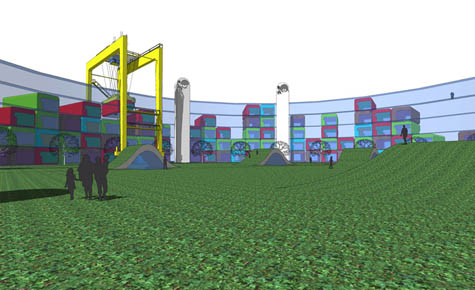 [Images: Two views of Corb v2.0 by Andrew Maynard]. [Images: Two views of Corb v2.0 by Andrew Maynard].
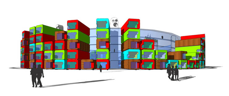
If a family doesn’t like where their home is located, they simply wait another day: “Yesterday this was a penthouse apartment on the other end of the complex,” Maynard explains. “Today the family has returned to find it on the ground floor.”
You can move up, down, left, right – even turn 180º around and face the other direction. You see sunset instead of sunrise, or a forest instead of a lake.
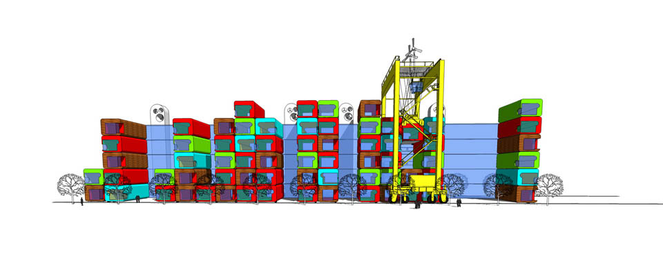   [Images: Three more views of Corb v2.0 by Andrew Maynard]. [Images: Three more views of Corb v2.0 by Andrew Maynard].
As Maynard describes it, this gigantic, crane-like stacking machine would smoothly glide back and forth over lines of “movable housing modules.” Residents could wake up to find themselves elsewhere, perhaps closer to the parking lot; neighbors would always have new neighbors.
This way, “everyone gets a penthouse as often as they get a ground level apartment” – which has the effect of “transforming traditional real estate valuations.”
 [Image: Corb v2.0 by Andrew Maynard]. [Image: Corb v2.0 by Andrew Maynard].
Taking this yet further, though, I'd suggest that we need more than isolated clusters of container-homes, each connected to one stacking machine. We need thousands of these things, aligned in continuous routes like train tracks, connecting neighborhoods, cities, countries, and continents. A house in the U.S. soon shows up in Mexico; a house in Utrecht moves to Sri Lanka. Immigration laws are rewritten, with complex architectural sub-rules. Customs officials the world over are required to take summer classes at SCI-Arc. Criminal homeowners shift back and forth across the International Date Line, avoiding taxes – while astronauts look down at great crowds of houses: whole cities migrating in a web across the earth.
Every once in a while, though, kicking off new schools of architectural thought and theory, there is a Great Accident. Architects stop reading Paul Virilio to concentrate on derailing entire cities...
(For more Andrew Maynard on BLDGBLOG see Unhinged and treeborne. For more posts that originally appeared in Blend, meanwhile, don't miss Fossil Rivers, The Weather Emperors, Urban Knot Theory, Abstract Geology, Wreck-diving London, and The Helicopter Archipelago).
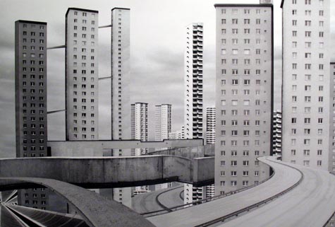
Flavio Galvagni of Lab Zero has a few projects that I think deserve mention here. 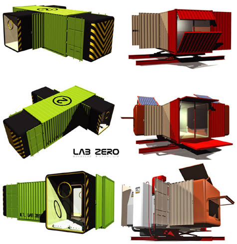 [Image: The solar-powered Minimum Mobile Module by Lab Zero]. [Image: The solar-powered Minimum Mobile Module by Lab Zero].Let me say right away, though, that I know a lot of people are tired of shipping container architecture – in fact, I think most people are tired of shipping container architecture – yet I have a fairly limitless patience for this sort of thing. Actually, I love shipping container architecture. But the same questions inevitably arise whenever things like this re-appear in the blogosphere: Are shipping containers comfortable? Is reusing them as a form of readymade architecture even structurally realistic? Would anyone really want to raise a family inside one of these things? And does the appeal of such designs actually cross cultures and income levels and ethnicities and, more important, climates? Sure, these might work in Santa Monica – but would they work in Minneapolis-St. Paul? To which I would have to say that the answer is: no, they probably aren't that comfortable when it comes to raising two and a half kids – and they probably don't equally appeal to, say, bedouins, Russian oil tycoons, Detroit's inner city poor, suburban parents, or even BLDGBLOG readers. But I don't think those are the right questions to ask. I don't think the point of cargo container architecture is for us to pretend that it's a universally appropriate design solution for every situation that could possibly exist in the world today – because it isn't. Then again, nothing is universally appropriate in architecture. What I think is, actually, the point of reusing shipping containers as architecture is: 1) when you can, you should reuse existing materials for somewhat obvious environmental reasons, and 2) the spatial, logical, and combinatorial systems that cargo containers imply are simply awesome. The possibilities excite me. Container-made buildings are fun to look at, they're fun to render, and they're fun to imagine forming new architectural reefs and Tetris cities, interlocking in a sci-fi future coming soon to a landscape near you. Whole new outer districts of London made from shipping container towers! 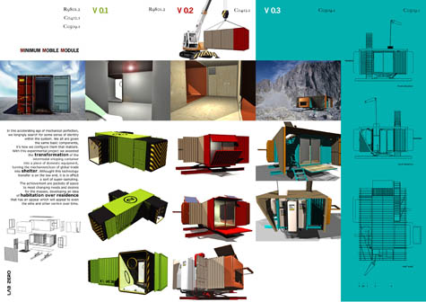 [Image: The Minimum Mobile Module by Lab Zero; view larger]. [Image: The Minimum Mobile Module by Lab Zero; view larger].So arguments about the architectural reuse of shipping containers shouldn't be based on the claim that it's all or nothing; it's not either we replace all existing architecture in the world with cargo containers and then force everyone to live in them or we never construct a single cargo container building anywhere ever again, even for something as simple as a meditation retreat in your own backyard. Maybe only one cargo container building will ever be built again – or maybe none will – but that doesn't mean we can't still screw around for hours on end with them on our home computers, virtually assembling weird new unfolding structures or houses with legs or helicopter-borne instant cities simply because it's fun and a way to kill time. In other words, even if these plans serve as nothing but design exercises – studies in volume, combination, and color – then that's fine with me. We can be done with the ongoing arguments and just enjoy looking at cool imagery. But I digress. Lab Zero has put together a number of cool projects, including the solar-powered Minimum Mobile Module, pictured above, and the Carapace House, below. 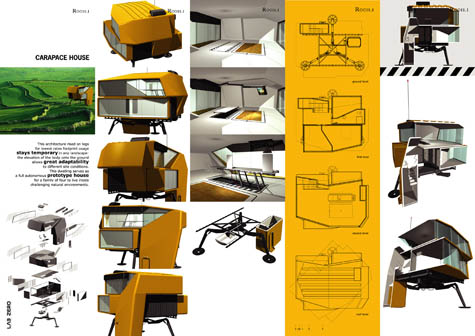 [Image: The Carapace House by Lab Zero; view larger]. [Image: The Carapace House by Lab Zero; view larger].The Carapace House – a larger diagram of which can be seen here – is intended for use in "challenging natural environments." Similar to Lab Zero's own Drop Off Unit, the Carapace House is temporary, mobile, and easy to "drop off" in a variety of locations. 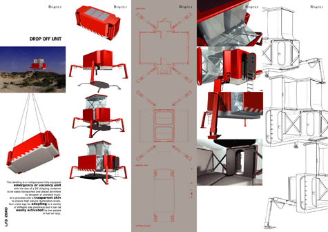 [Image: The Drop Off Unit by Lab Zero; view larger or in more detail]. [Image: The Drop Off Unit by Lab Zero; view larger or in more detail]. All of which brings us to the Jellyfish House – not that Jellyfish House – a kind of floating tower perfect for those of us interested in "spatial delocation." You can drift around the world's oceans in it, reading William Gibson.  [Image: The Jellyfish House by Lab Zero; view bigger]. [Image: The Jellyfish House by Lab Zero; view bigger].The Lab Zero website is still apparently under construction, meanwhile, but keep your eye out for more of their work in the future. They were featured in Actar's recent book Self-Sufficient Housing, for instance, and will no doubt be popping up elsewhere soon. And for more cargo containers on BLDGBLOG see Container Home Kit or even Project Blackbox.
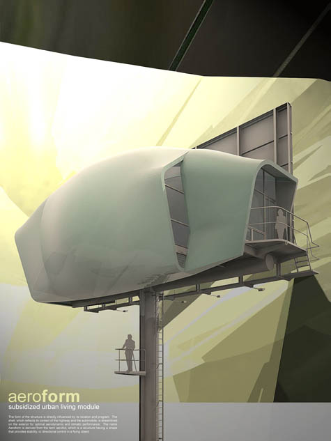 [Image: A project by Brendan O'Grady/nocturnal design lab, suggesting what an inhabited billboard mast might look like; view larger. For another such project see BLDGBLOG's look at the awesome Single Hauz. O'Grady's design was produced for, and won an award as part of, the 2007 KRob architecture competition; found via Archinect]. [Image: A project by Brendan O'Grady/nocturnal design lab, suggesting what an inhabited billboard mast might look like; view larger. For another such project see BLDGBLOG's look at the awesome Single Hauz. O'Grady's design was produced for, and won an award as part of, the 2007 KRob architecture competition; found via Archinect].
In an old book by John McPhee, called In Suspect Terrain, we meet a geologist named Anita Harris who takes McPhee on a tour of post-glacial North American landscapes. The two of them drive through and discuss "a confused and thus beautiful topography of forested ridges and natural lakes, stone fences, bunkers and bogs, cobbles and boulders under maples and oaks," and they follow the moraines, that line of retreat at which the glaciers stopped, hiking over "hills of rock debris" that were dragged into place – by ice – ten thousand years ago.  At one point Harris comments that glaciers and golf go together like wind and surfing: "This would be a good place for a golf course," Anita remarked, and scarcely had she uttered the words than – after driving two thousand yards on down the road with a dogleg to the left – we were running parallel to the fairways of a clonic Gleneagles, a duplicated Dumfries, a faxed Blairgowrie, four thousand miles from Dumfriesshire and Perthshire, but with natural bunkers and traps of glacial sand, with hummocky roughs and undulating fairways, with kettle depressions, kettle lakes, and other chaotic hazards. "If you want a golf course, go to a glacier" is the message according to Anita Harris. "Golf was invented on the moraines, the eskers, the pitted outwash plains – the glacial topography – of Scotland," she explained. "All over the world, when people make golf courses they are copying glacial landscapes. They are trying to make countryside that looks like this. I've seen bulldozers copying Scottish moraines in places like Louisiana." 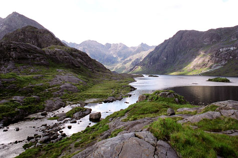 And, sure enough, as only one example, if you read about the golf course in Kohler, Wisconsin, you learn the following: The River Course at Blackwolf Run is a commanding layout that offers a dynamic golf challenge with sweeping panoramic views of the Sheboygan River valley. A glacier served as early landscape architect for this site, sculpting river valleys with deep ravines, meadow plains, gentle rolling hills and abundant lakes. Ten thousand years later, Pete Dye took this same piece of land, added his signature style and designed one of the best golf courses in America. All of which indirectly reminds me of one of my favorite posts on Pruned, in which we read about a golf course in Ohio that's been constructed atop a series of old Native American moon-viewing mounds. That landscape itself, in other words, is not only artificial – it is, in fact, a 2000-year old earthwork temporarily lost to view under thickets and autumn leaves (until the golf course came through, clearing the scene) – but the whole thing is also astronomically aligned with the cycles of the moon. Now that this strange overlay has been discovered, we read, "there is an eagerness among many people to see moonrises from the mounds the way the Indians did, a desire that has caused a conflict with the golf club." Imagine a golf course deliberately aligned with the universe! You study astronomy with a putter in your hand, hiking amidst coincidence like some strange god on a midwestern hillside. But the fact that a climatic occurrence ten thousand years ago – the most recent Ice Age – actually formatted the landscape in such a way as to help make golf possible just floors me. That the design of golf courses is thus a continuation of the Ice Age – by means other than geology – is just icing on the cake. And that this specific type of landscape – the golf course – is then exported, repeated, and cloned, via bulldozer, in decidedly non-glacial landscapes all over the world, from the urban cores of Chinese cities to American military bases in Afghanistan, only adds to the fascination.  [Image: Found, via a Google Images search, here; some of the comments there beggar belief]. [Image: Found, via a Google Images search, here; some of the comments there beggar belief].We are the glaciers now™. (More: Pruned's Of tumuli, moonrises, and a nice Par 3 and John McPhee's In Suspect Terrain).
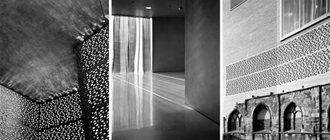 [Images: The Kolumba art gallery, by Peter Zumthor]. [Images: The Kolumba art gallery, by Peter Zumthor].Steve Rose of the Guardian this morning greets us with a "magnificent art gallery with a ruined gothic church in the basement." The gallery is in Cologne, Germany, it's called Kolumba, and it was recently designed by architect Peter Zumthor. The building's "cavernous ground-floor room," Rose writes, "is dimly lit, but fresh air and dappled sunlight spill in from honeycomb-like perforations high above." Even better: "Embedded in the light brick walls are the blackened windows and arches of a ruined gothic church, onto which this new building has been grafted." And, "disappearing into the depths and the darkness, are the excavated ruins of crypts, vaults and foundations." 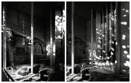 [Images: The Kolumba art gallery, by Peter Zumthor]. [Images: The Kolumba art gallery, by Peter Zumthor].The backstory, briefly, is that the church – called St. Kolumba – was "reduced to rubble during the second world war," but, we read, "[a] wooden Madonna survived the bombing so, after the war, local architect Gottfried Böhm built the small octagonal chapel on the site, dedicated to the 'Madonna of the Ruins'. In the 1970s, excavations revealed evidence of previous churches, not to mention vaults filled with human bones." Evidence of previous churches! Such a beautiful phrase. Finding evidence of other buildings – older buildings – inside the building you're now standing in. Or perhaps you find evidence of a newer building, inside the building you're standing in – and you realize, stunned, that someone is replacing the building, slowly and in secret over the course of several years, in bits and pieces, here and there, leaving traces, evidence, clues. In any case, Kolumba, with its swirling foundations on top of foundations on top of crypts, now houses religious art. In 650 years, someone will build another museum atop its wreckage. (Thanks, Nicky!)
 Just a reminder that I'll be speaking in Los Angeles tonight at the Southern California Institute of Architecture, in case you're around. The event is free, it starts at 7pm, it's open to the public, and it's located here, with plenty of parking. It will be the single most exciting thing that's ever happened, anywhere.
The Guardian recently introduced us to a series of images, produced by artists Pedro Armestre and Mario Gómez, for a new project by Greenpeace. The images show us what Spain will look like in the future, in a world transformed by climate change. 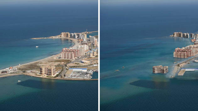 [Image: By Pedro Armestre and Mario Gómez]. [Image: By Pedro Armestre and Mario Gómez].The basic idea here is that these visions of flooded resort hotels, parched farmlands, and abandoned villages, half-buried in sand, will inspire us to take action against climate change. Seeing these pictures, such logic goes, will traumatize people into changing how they live, vote, consume, and think. You can visually shock them into action, in other words: one or two glimpses of pictures like these and you'll never think the same way about climate change again. But I'm not at all convinced that that's what these images really do. 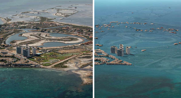 [Image: By Pedro Armestre and Mario Gómez]. [Image: By Pedro Armestre and Mario Gómez].In fact, these and other visions of altered planetary conditions might inadvertantly be stimulating people's interest in experiencing the earth's unearthly future. Why travel to alien landscapes when you can simply hang around, driving your Hummer...? A few years go by and the planet is suddenly different. So if the speculative landscapes pictured here are both imminent and immanent – if they are both inevitable and hidden inside the landscapes we see today, simply waiting for their opportunity to materialize (through drought, flood, fire, etc. etc.) – then there also seems to be a growing curiosity about what the world of tomorrow will really look like. But mere seeing, I would guess, is not enough: I would assume, in fact, as more images of our climate-changed future are produced, that more and more people will simply gear themselves up to experience that future firsthand. If this is what's coming, then let's buy more bottled water. Climate change is the adventure tour of a lifetime – and all it requires is that you wait. Then all the flooded hotels of Spain and south Florida will be yours for the taking. Given images like these, the future looks exciting again. 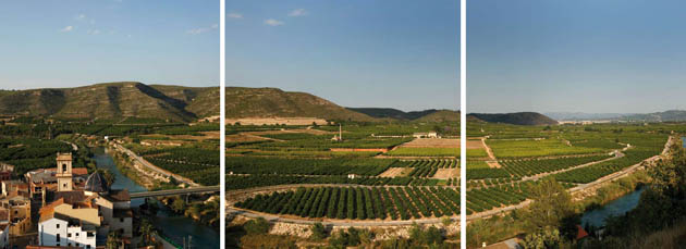 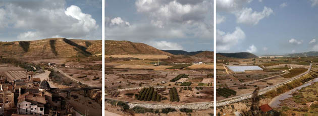 [Images: By Pedro Armestre and Mario Gómez]. [Images: By Pedro Armestre and Mario Gómez].Of course, such thinking is absurd; thinking that flooded cities and continent-spanning droughts and forest fires will simply be a convenient way to escape your mortgage payments is ridiculous. Viewing famine, mass extinction, and global human displacement into diarrhea-wracked refugee camps as some sort of Outward Bound holiday – on the scale of a planet – overlooks some rather obvious downsides to the potentially catastrophic impact of uncontrolled climate alteration. Whether you're talking about infant mortality, skin cancer, mass violence and rape, waterborne diseases, vermin, blindness, drowning, and so on, climate change entails radically negative effects that aren't being factored into these escapist thought processes. But none of those things are depicted in these images. These images, and images like them, don't show us identifiable human suffering. 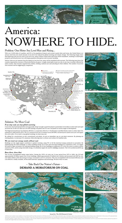 [Image: A full-page ad in The New York Times by Architecture 2030]. [Image: A full-page ad in The New York Times by Architecture 2030].So what do these images show us? What we see is a world transformed, made unearthly, like something from a J.G. Ballard novel. Where there once was a pristine beach, the sea has returned, giving us modern ruins: sandbars in the lobbies of hotels, tide pools accumulating on the boardwalks of towns you didn't like in the first place. What appear to be coral reefs are the underwater remains of marinas. What look like atolls are lost subdivisions, or banks at the bottom of the sea. Maintaining the J.G. Ballard reference, this description is from his book The Drowned World: Giant groves of gymnosperms stretched in dense clumps along the rooftops of the submerged buildings, smothering the white rectangular outlines... Narrow creeks, the canopies overhead turning them into green-lit tunnels, wound away from the larger lagoons, eventually joining the six hundred-yard-wide channels which broadened outwards toward the former suburbs of the city. Everywhere the silt encroached, shoring itself in huge banks against a railway viaduct or crescent of offices, oozing through a submerged arcade... Many of the smaller lakes were now filled in by the silt, yellow discs of fungus-covered sludge from which a profuse tangle of competing plant forms emerged, walled gardens in an insane Eden. Lush, science fictional, Romantic: apparently this is the future of climate change. My point in saying all this is simply that these images don't shock; they're more like posters for tomorrow's specialty tourism firms. After all, there is no one way to interpret these images; there is no singular narrative by which to understand them, or comprehend them. Just look at photographs of New Orleans after Hurricane Katrina: that drowned city, for the political Left, became a symbol of all that is wrong with American Conservativism – that people like Dick Cheney would launch debt-fueled oil wars in the deserts of foreign countries while remaining blind to problems of national infrastructure back home – yet, for the political Right, New Orleans was a sign of what happens when you're forced to rescue, over and over again, a whole social class that refuses, or is systematically unable, to look after itself. In other words, go show someone a photograph of New Orleans underwater – then tell me what they say that photograph "means" to them. Then show them these images. Then tell me what these images mean. 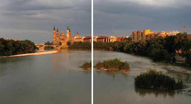 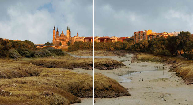 [Images: By Pedro Armestre and Mario Gómez]. [Images: By Pedro Armestre and Mario Gómez].What are we supposed to take away from these scenes, then? Does the religious Right look at these images and see what the political Left sees – or even what the financial Right sees, that opportunity-seeking managerial class of entrepreneurs and venture capitalists? What about New Age utopians? What about BLDGBLOG readers? What about Muslim fundamentalists? Do visions of a submerged Manhattan make Hamas want to burn less oil? Because there is not one singular explanation for these images; there is not one scientific narrative or political diagnosis that everyone will agree on. Some people, as I've said, may even be excited: South Beach is under five feet of water...? Get your camera... In any case, interpreting these Greenpeace images gets even more interesting when you reverse the original sequence in which some of them first appeared.  [Images: By Pedro Armestre and Mario Gómez]. [Images: By Pedro Armestre and Mario Gómez].Let's say, then, that here, in the image featured above, we are looking at central California before corporate water lobbyists have pushed huge irrigation bills through Congress. We see unaffected Nature, with a capital N, with all its colors and rough edges: the water has yet to arrive, flowing in from distant pumps and reservoirs, and so Nature is still in balance with itself. It may be dry, in other words, but it is still vaguely Edenic. Now, however, in the image below, let's say that this is what money, influence, and tightly controlled aqueducts will bring. What should be desert, in other words – raw, beautiful desert – has become an apricot farm: gridded, geometric, and designed to turn a profit.  [Images: By Pedro Armestre and Mario Gómez]. [Images: By Pedro Armestre and Mario Gómez].Again, my point is simply that these images lend themselves to a huge variety of interpretations – and so looking at them, in any order, can result in someone being offended, whether that someone is an environmentalist, a preacher, or a libertarian taxpayer. And yet my intention is not to question – or, worse, trivialize – the effects of climate change, or to imply that the real danger of climate change is that someone will be "offended" by it; my intention is simply to question the visual rhetoric through which climate change is now being addressed. How do we visually represent climate change in a way that will make more people take it seriously? Because cinematic, quasi-Spielbergian images of drowned cities simply don't accomplish that. Only half-jokingly, I might even suggest that the real way to scare people about climate change – assuming that fear is the correct tactic to use here – is not through referring to landscape at all, but through threats involving 1) sex and 2) children. All that pollution... so much carbon in the atmosphere... dirty water, social unrest, lack of food... Well, your prostate will swell with metal and your kids will all drown. In any case, aerial views of an underwater Manhattan, or Romantic landscape photographs of the Spanish countryside, simply do not inspire people to turn the lights down or drive their Escalades less frequently. If you want to use fear – and that's a huge if – then choose something scary. As it is, we're being told that we should worry about climate change... because it resembles one of the most exciting tropical adventures ever to befall the human race. Who's going to get upset about that? (Remarkably similar thoughts can be found in BLDGBLOG's earlier post: Liberation Hydrology: Miami, 2107 A.D.).
|
|
 [Image: Bel-Air by Mathieu Lehanneur].
 [Image: Bel-Air by Mathieu Lehanneur].
 [Images: The Oxygen Garden from Sunshine, courtesy of DNA Films].
 [Image: The IceCube's surface workings, Antarctica; via
  [Image: A schematic diagram of the
  [Image: A glimpse of the Transantarctic Range].
 [Image: Algae balloon communities in Iceland by the Philadelphia-based
  [Image: Algae balloons and the houses they serve, by the
  [Image: An Icelandic hydrogen economy, outlined by the
  [Image:
  [Image: A broader view of the plan by the
  [Image: Boutique Monaco by

 [Images: Three rendered views of the building's lobby and ground level exterior].
 [Images: Day and night renders of the project's exterior, complete with punctuated vertical bays of greenery and residential terracing; view both the
  [Image: A kind of rooftop park and bioscape, complete with what appears to be a helipad].
 [Image: The Boutique Monaco under construction; view
  [Image: Bracing at the base of the Boutique Monaco; view
  [Image: This post was originally published last winter in
  [Image: Photo by Stewart Cairns for
  [Image: Photo by James Edward Bates for
  [Image: Photo-illustration by Aaron Goodman for the
  [Image: Photo by John Fuentes, found via the
  [Image:
 [Images: Two views of

 [Images: Three more views of
  [Image:
  [Image: The solar-powered
  [Image: The Minimum Mobile Module by
  [Image: The Carapace House by
  [Image: The Drop Off Unit by
  [Image: The Jellyfish House by
  [Image: An "
 [Image: A project by Brendan O'Grady/nocturnal design lab, suggesting what an inhabited billboard mast might look like; view
  At one point Harris comments that glaciers and golf go together like wind and surfing:
 And, sure enough, as only one example, if you read about the golf course in
  [Image: Found, via a Google Images search,
  [Images: The
  [Images: The
  Just a reminder that I'll be speaking in Los Angeles tonight at the
  [Image: By
  [Image: By
 [Images: By
  [Image: A full-page ad in The New York Times by
 [Images: By


